Unlike many websites that are primarily used for marketing and PR purposes, this site is an archive. Under this menu item, works from the years 2009 to 2018 are presented – created after moving back to Düsseldorf, after twenty years in Norway and Scotland.
With this new studio phase, digital images and collages take centre stage, fed by a growing collection of images. At the same time, a new form of structuring begins: series are summarised in books. These books initially serve to provide a very pragmatic overview – a necessary tool for extensive groups of works. They allow you to leaf through them, to pause for a moment. But they also give other interested parties access to the artistic work – parallel to the website.
All books contain introductory texts. Over time, the texts become more detailed, accompany individual chapters and soon develop their own, equal role. They do not comment on the pictures, they are not a theoretical superstructure. Rather, they often emerge afterwards – as a linguistic approximation of thoughts that have developed in the background during the production of the pictures. In this interweaving lies a great closeness to the images, without any attempt to interpret or explain them.
Only selected examples from the extensive series are shown on the website – as teasers, as a first impression. The complete series of images and accompanying texts can be found in the books, which are produced in small editions or on demand and are available in the shop. Some of the early books are currently being redesigned and reissued – with increased experience in dealing with design, printing and production.
Book 6 - Access to Files – 2018
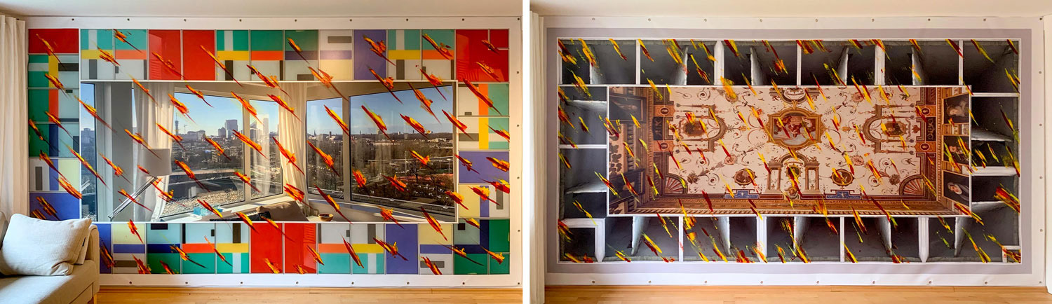
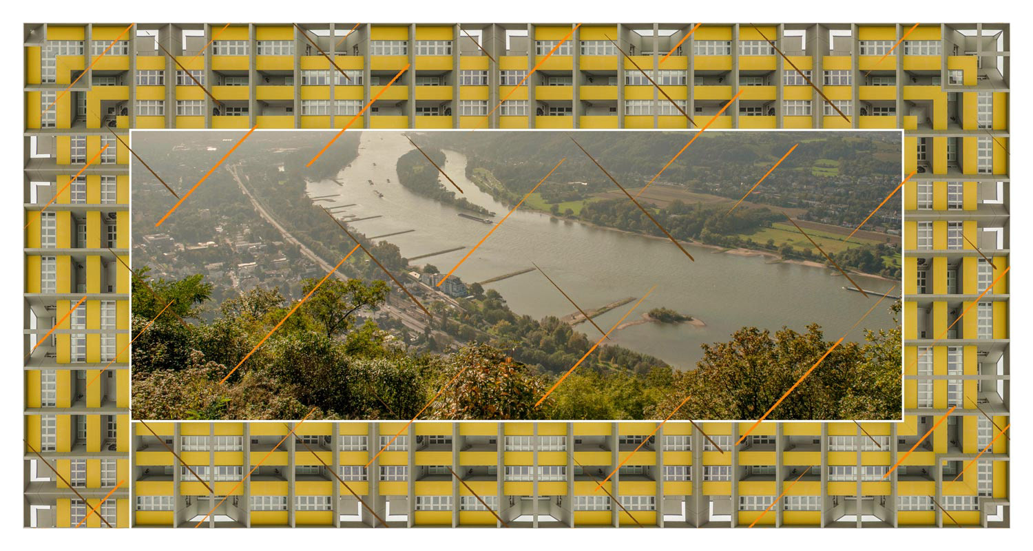
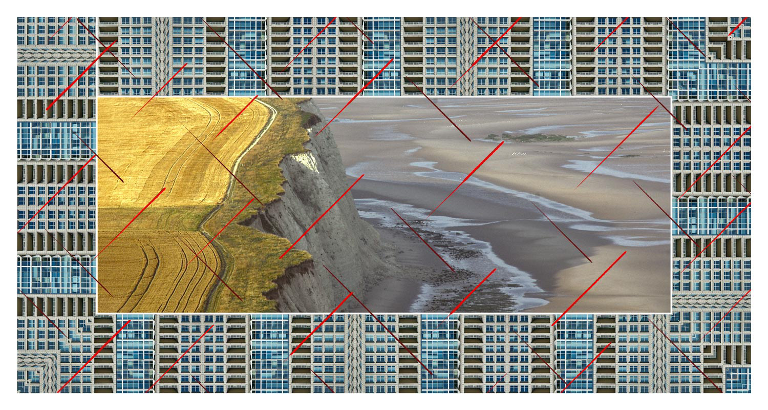
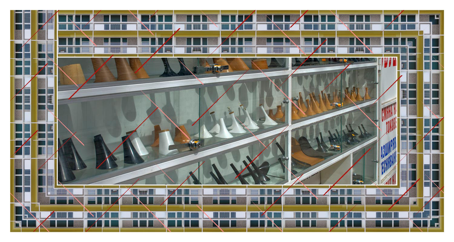
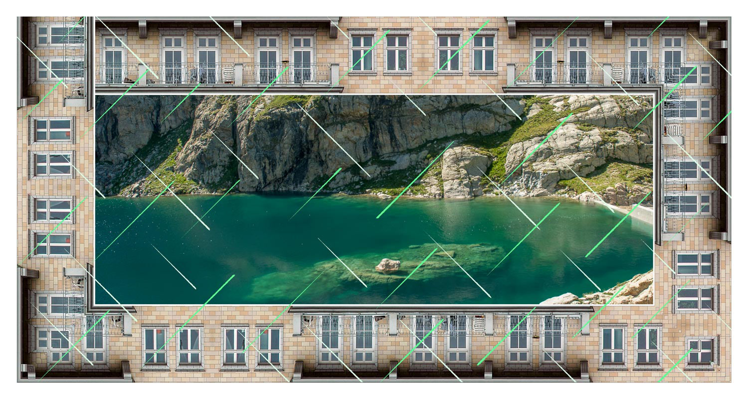
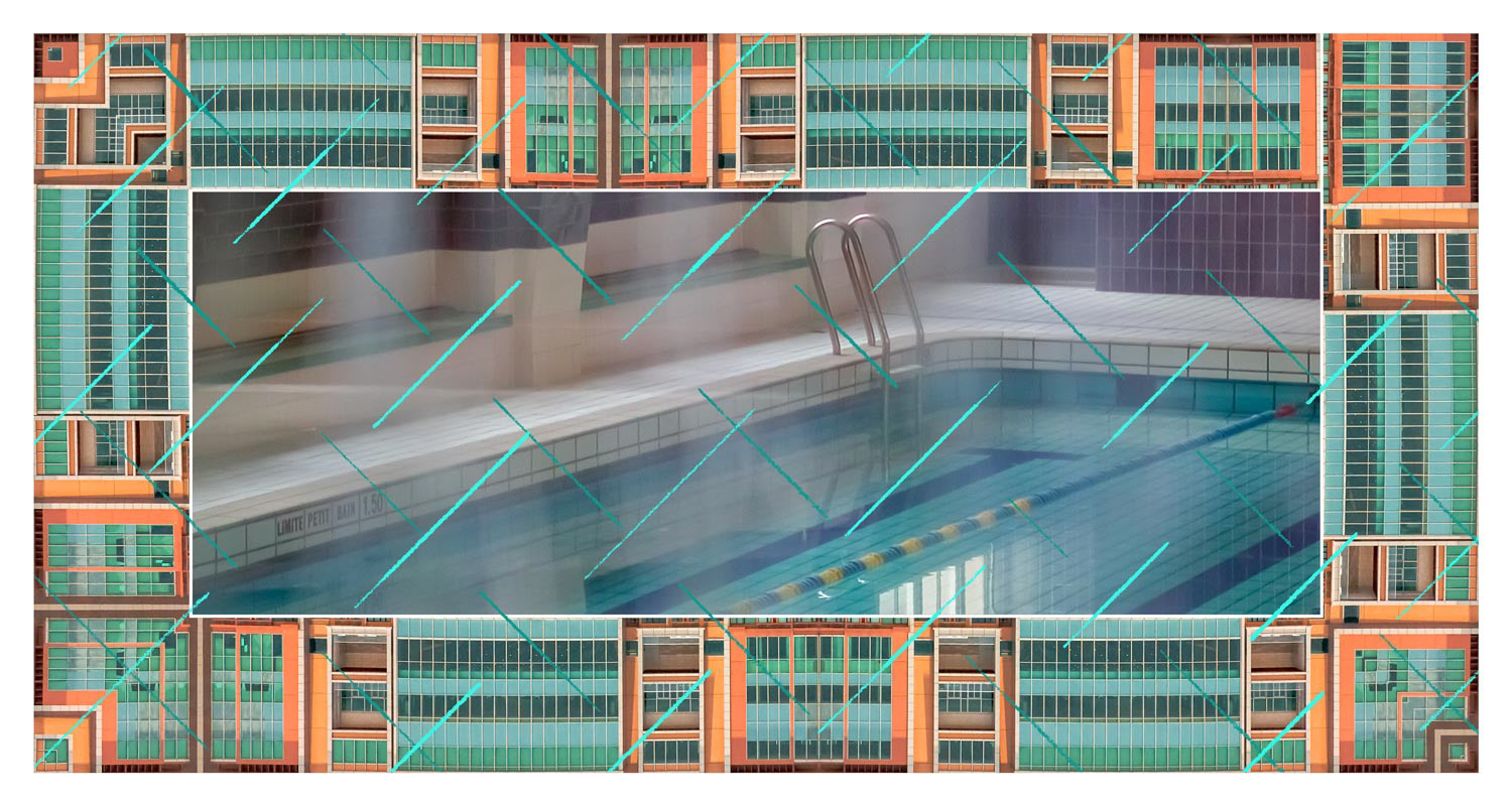
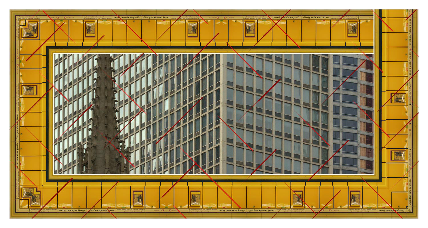
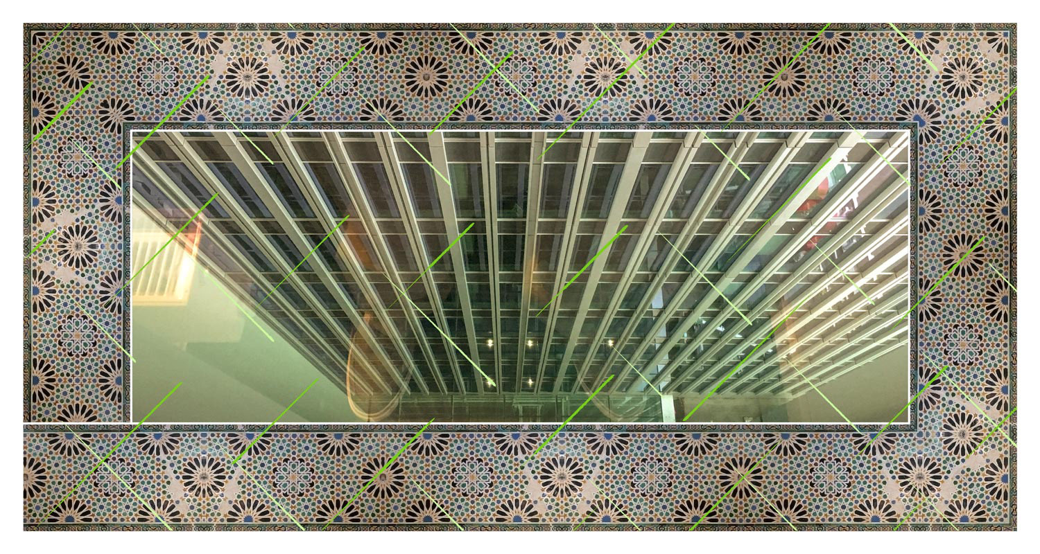
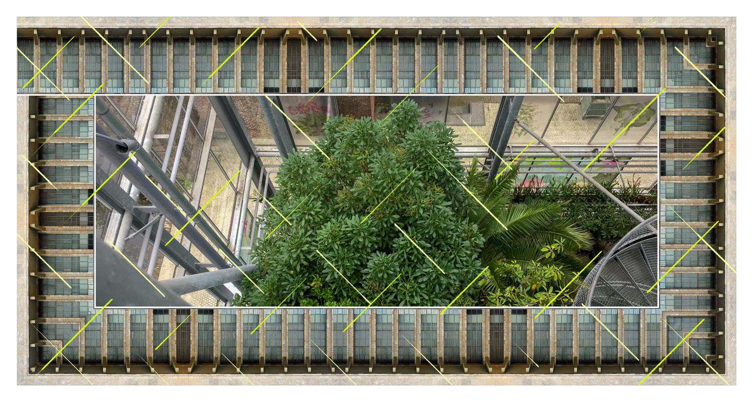
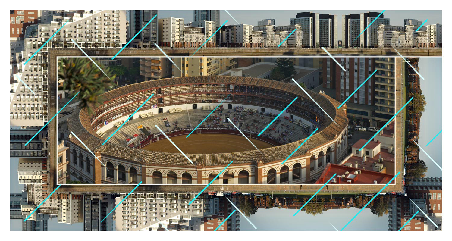
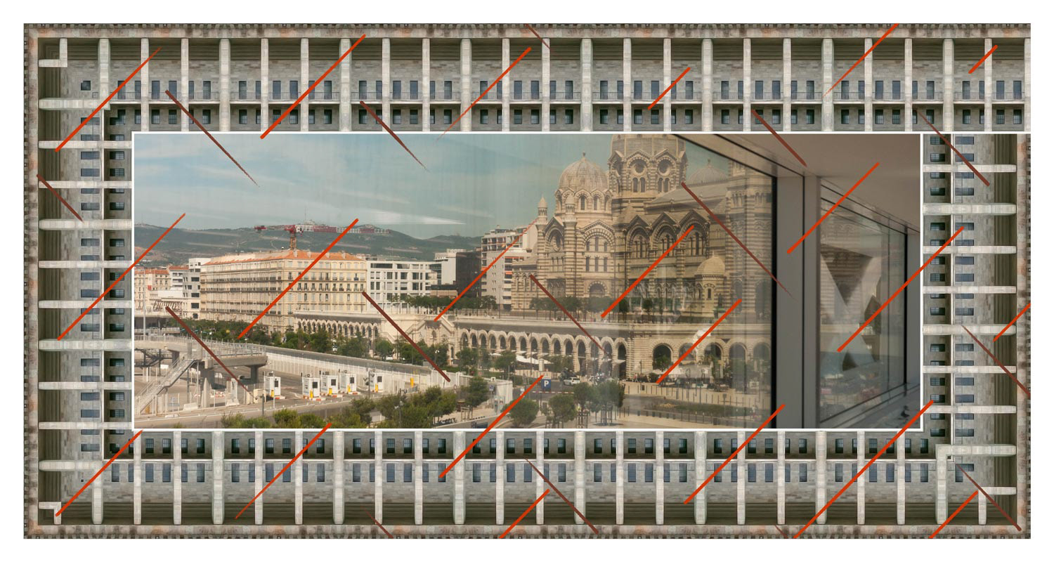
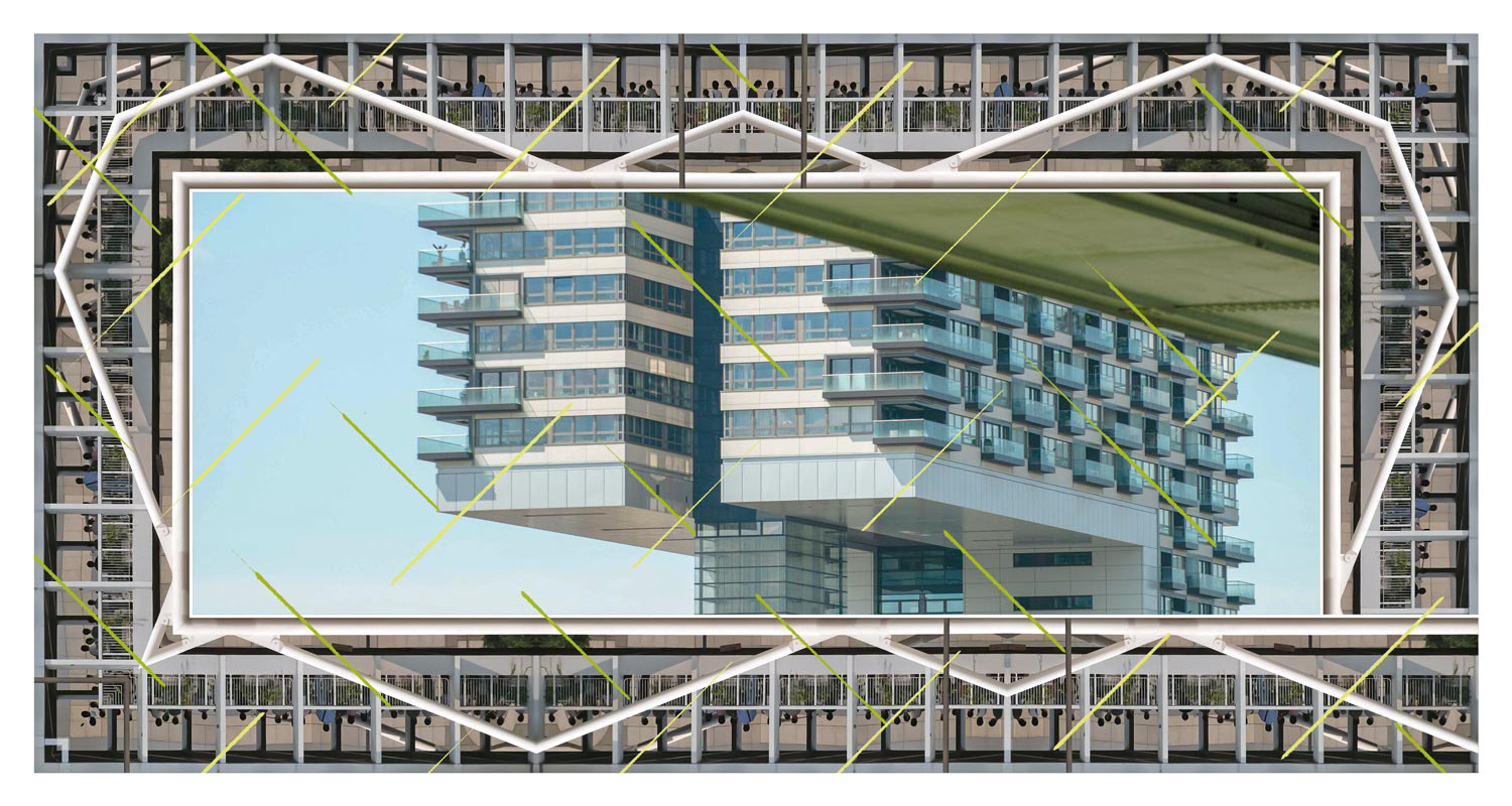
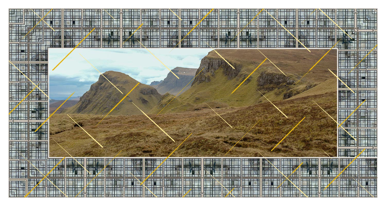
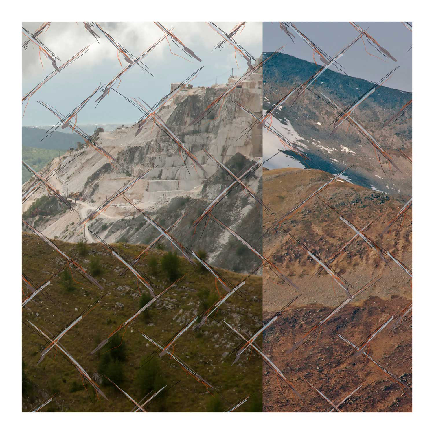
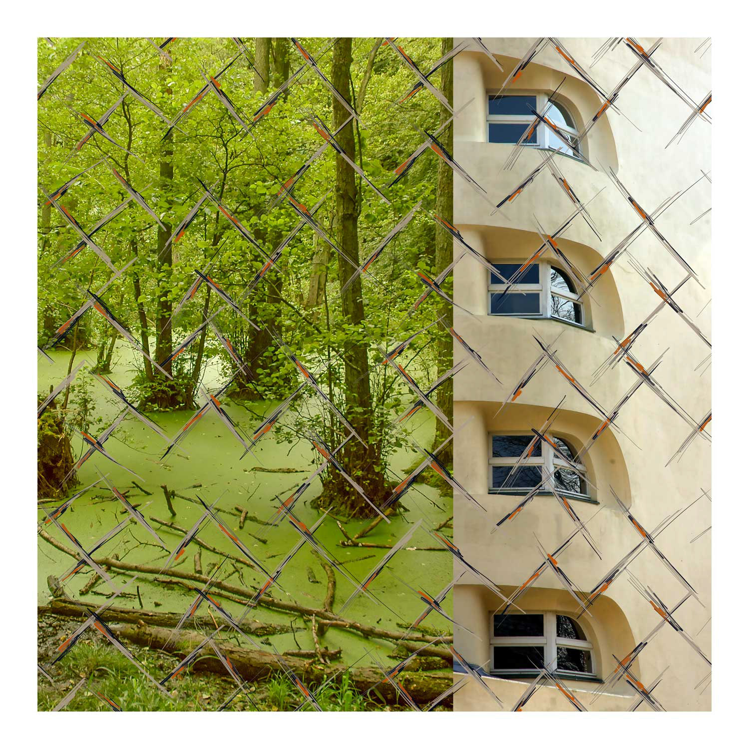
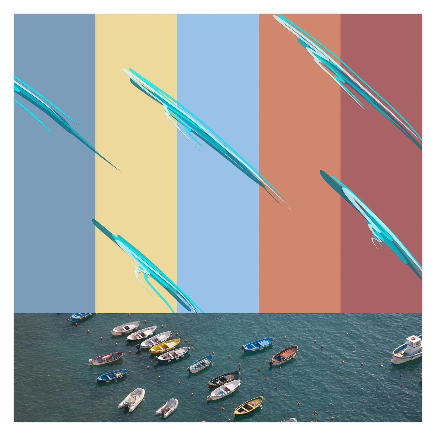
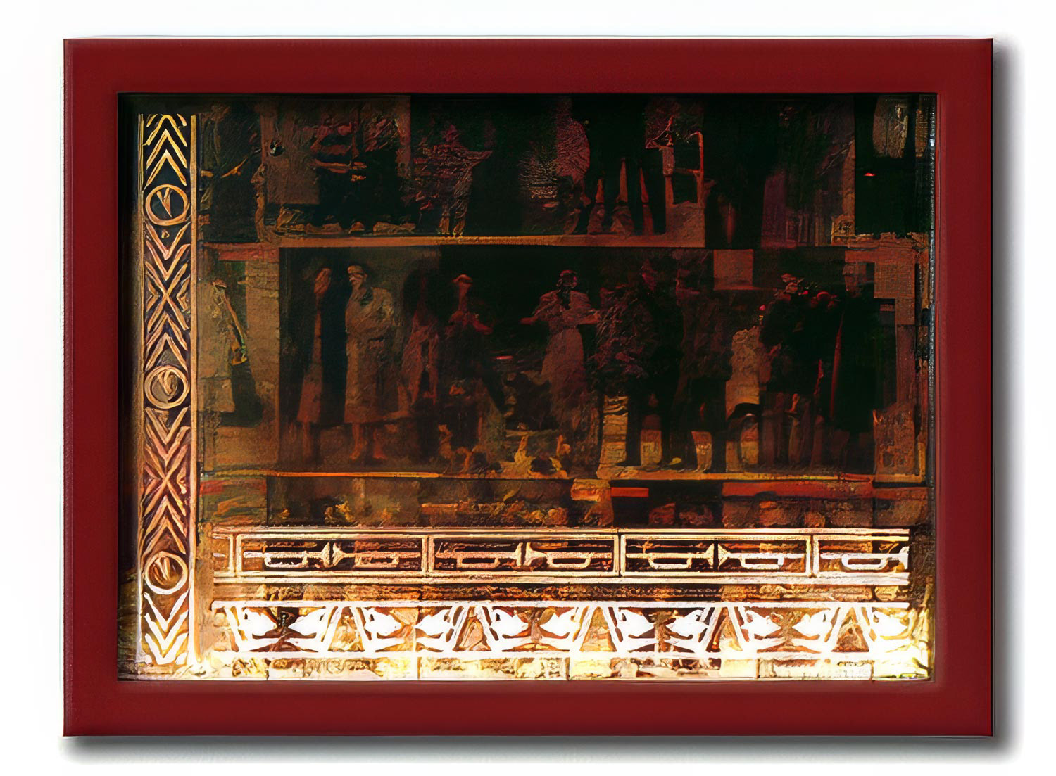
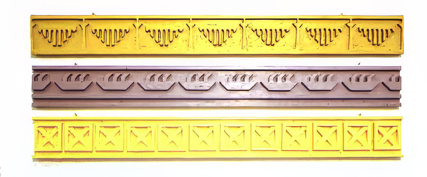
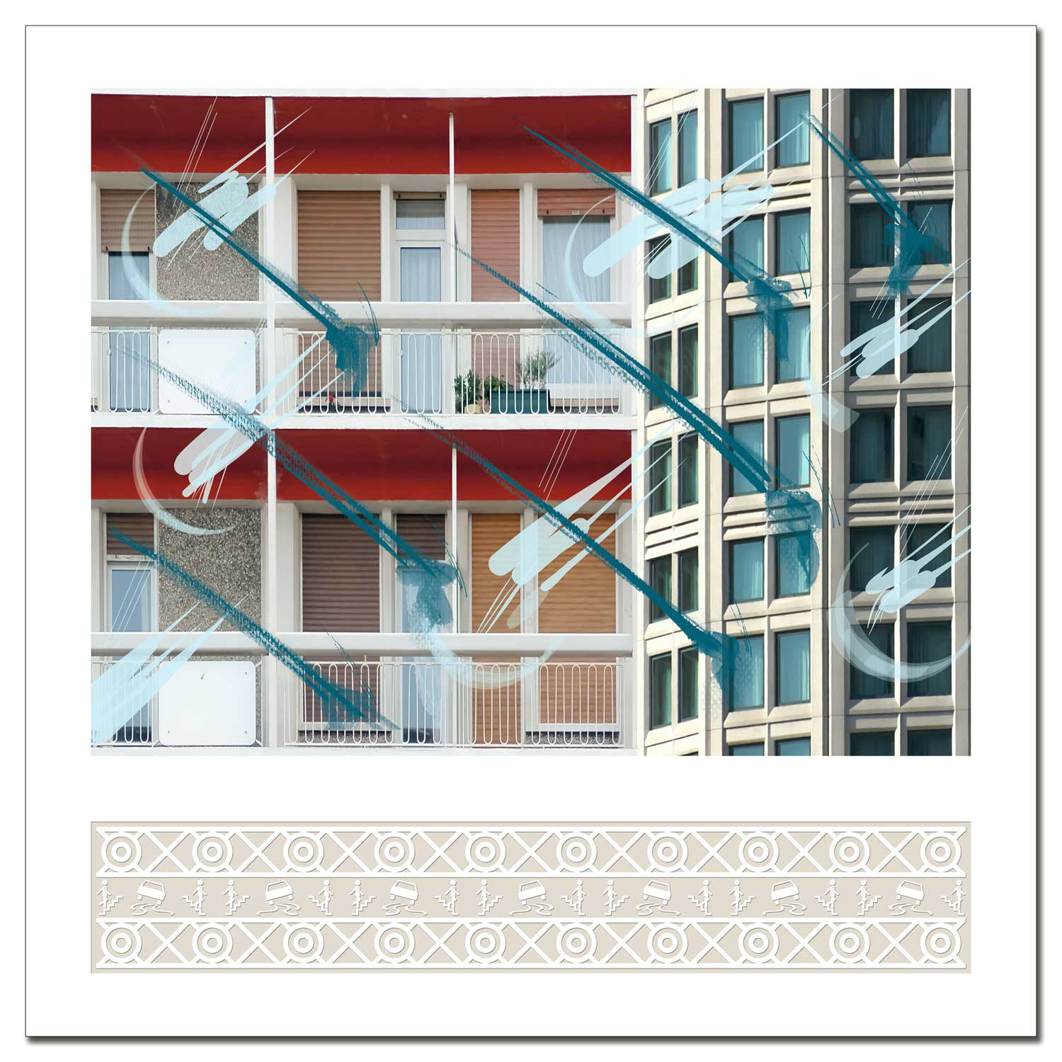
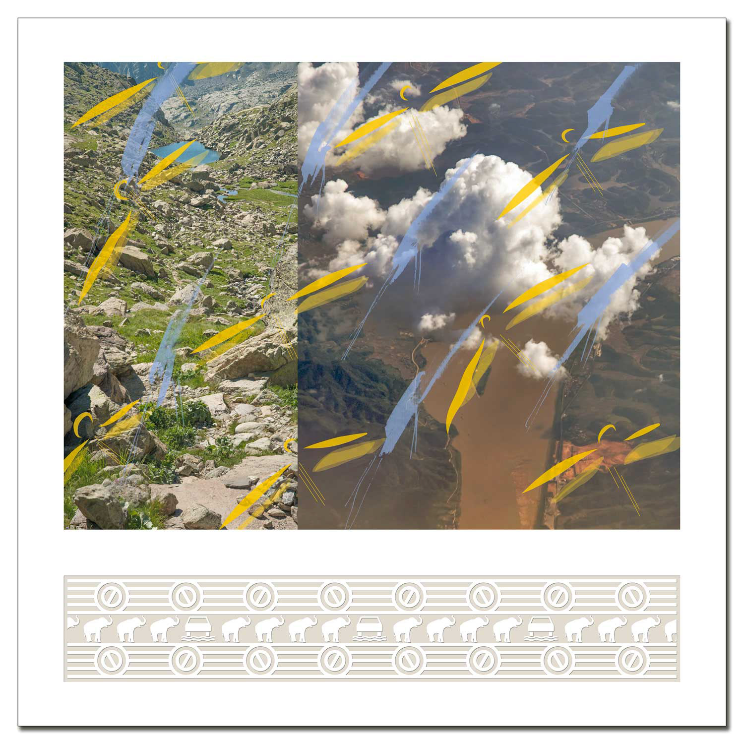
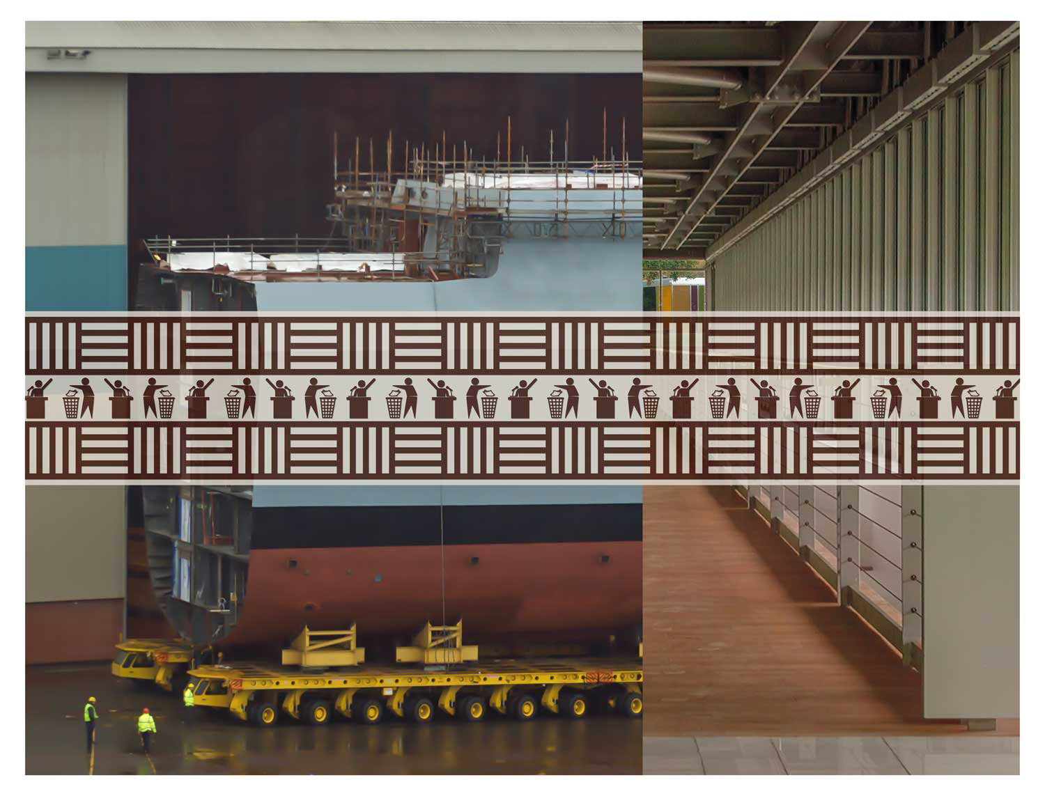
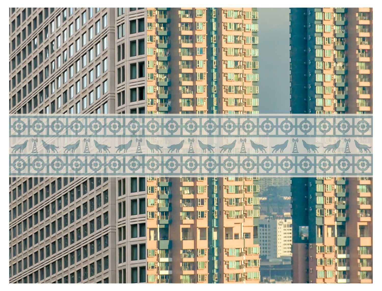
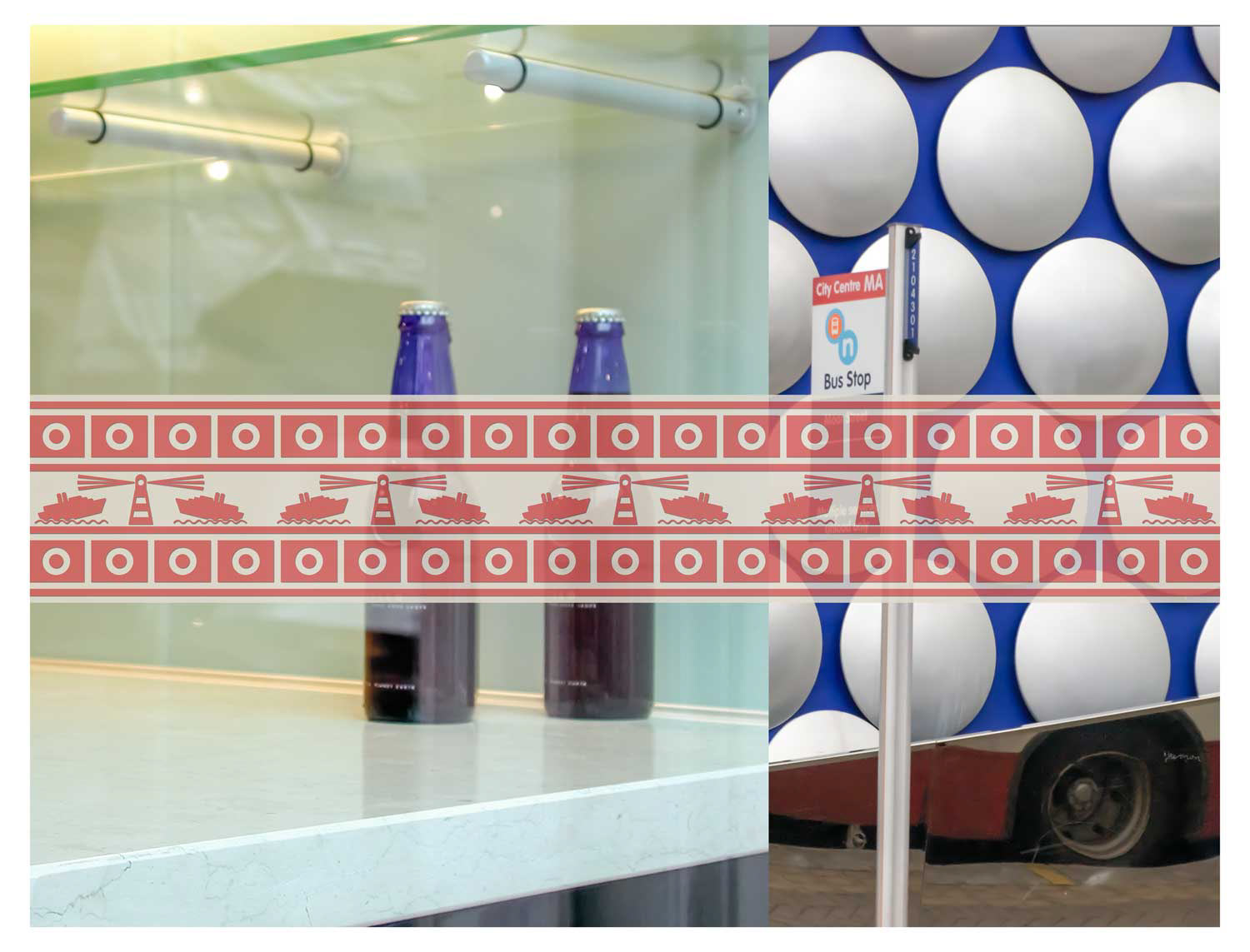
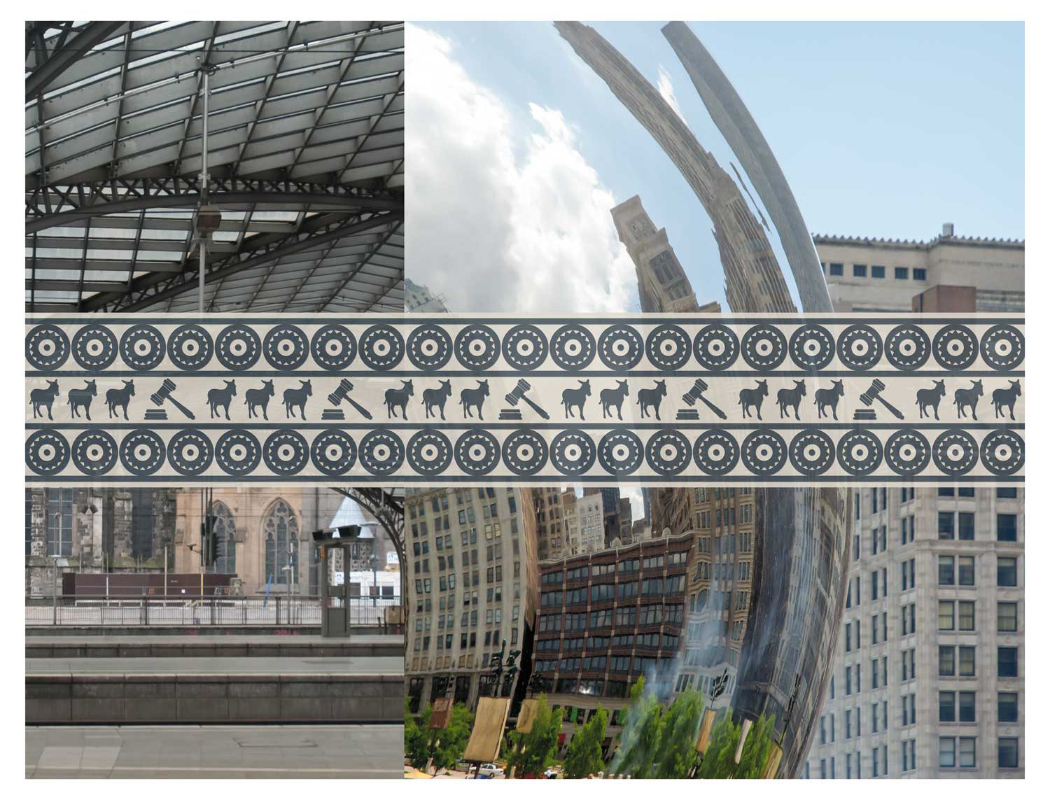
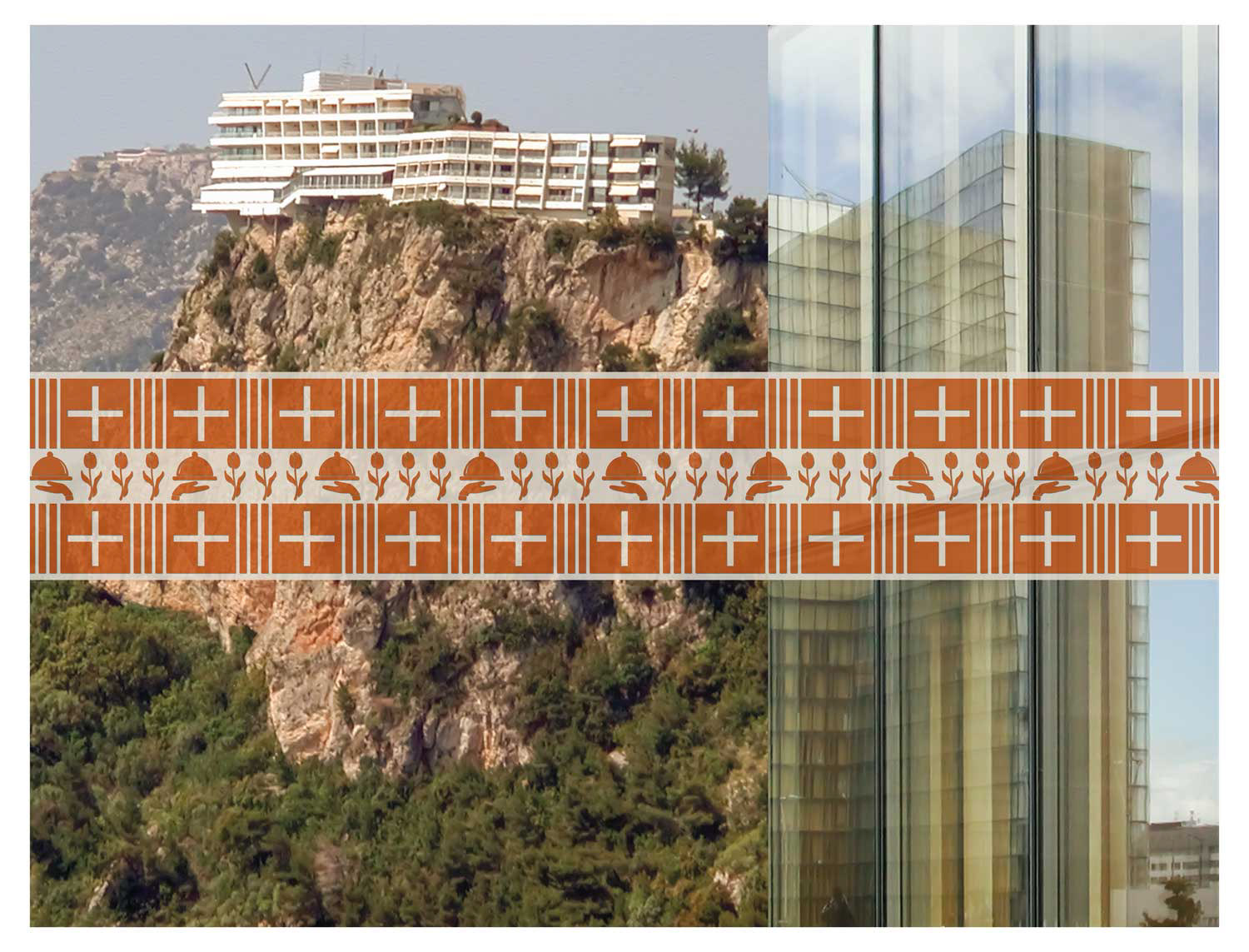
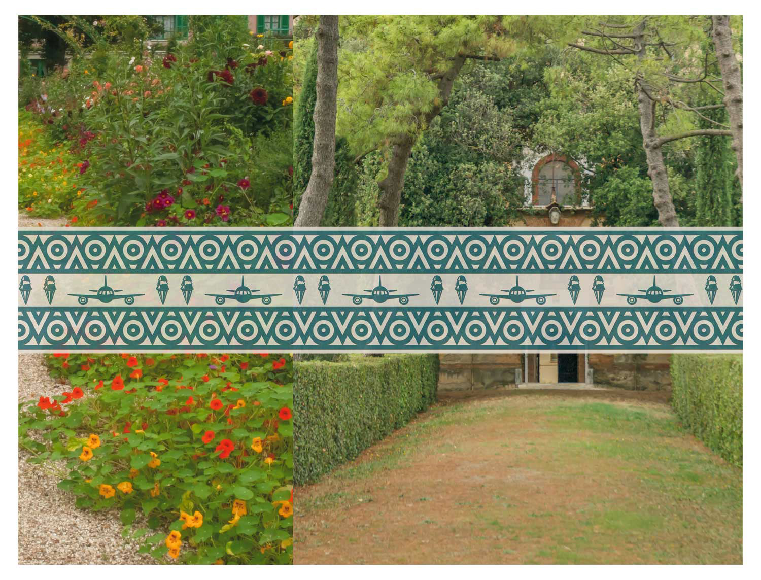
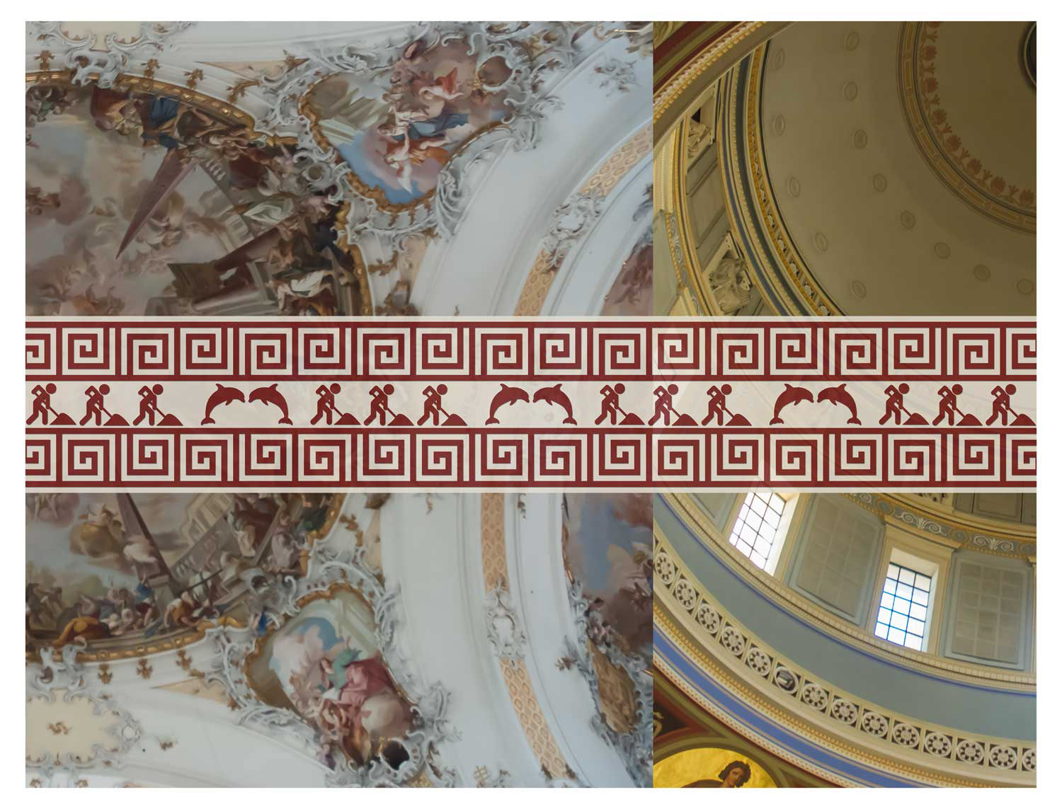
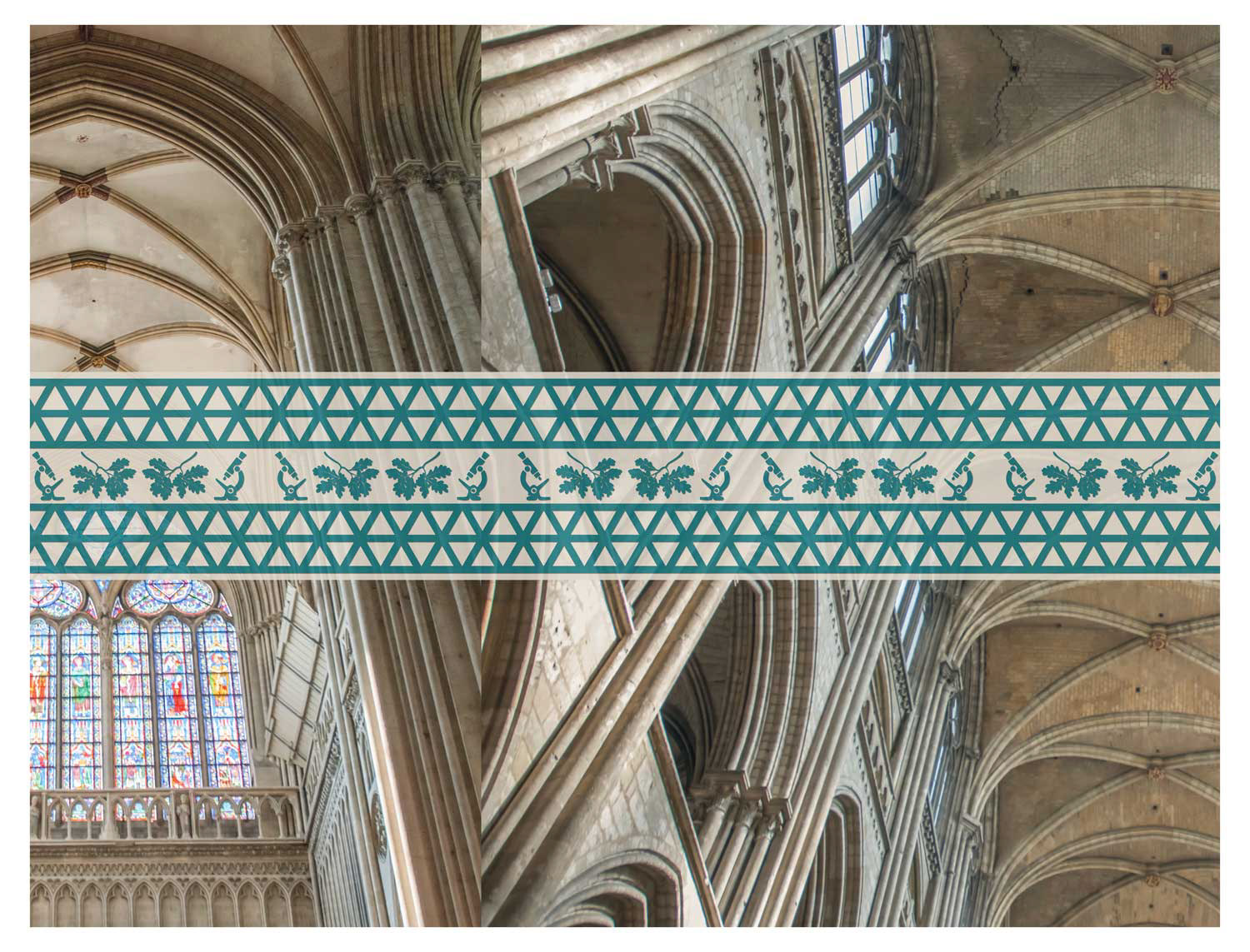
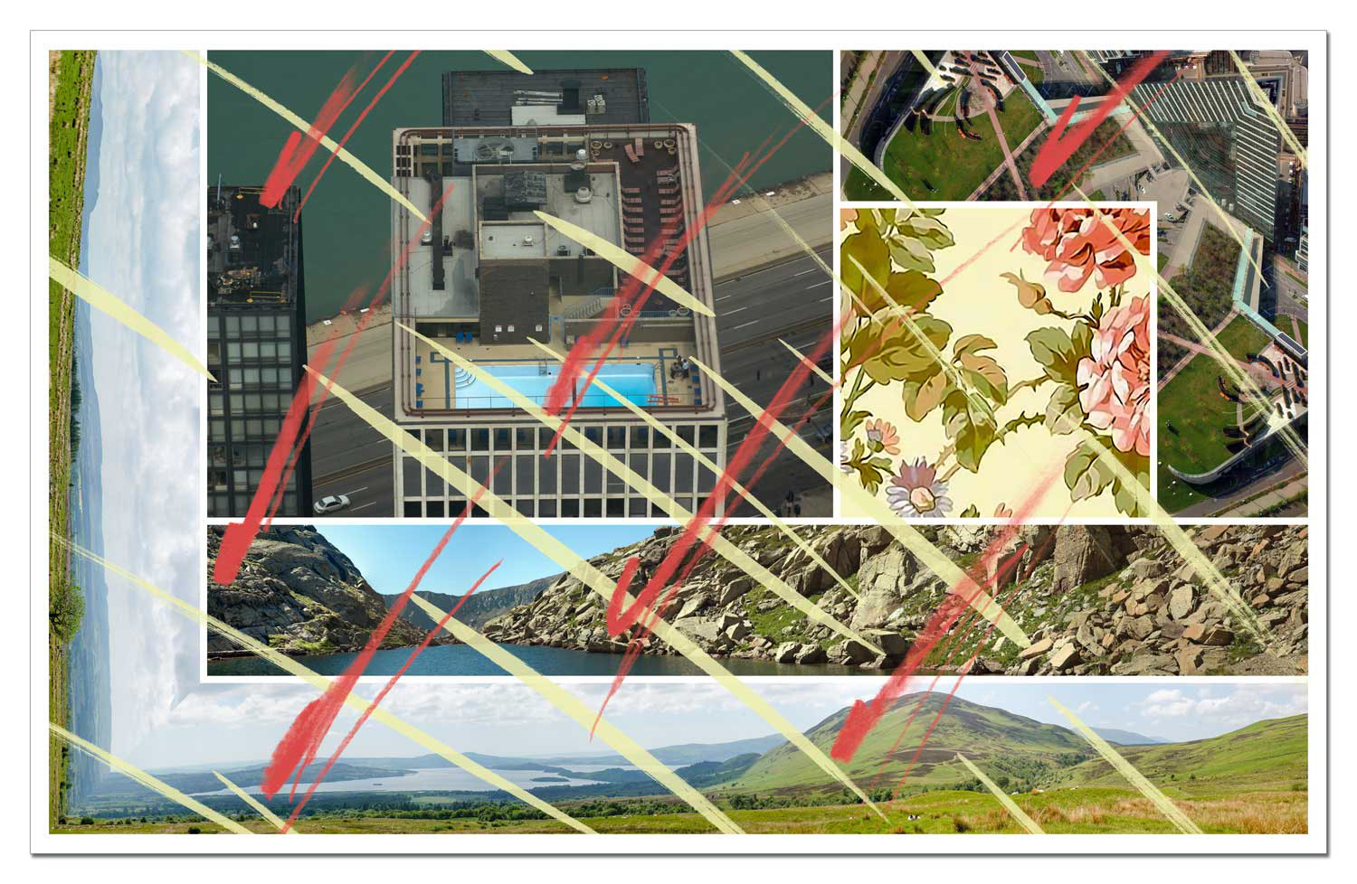
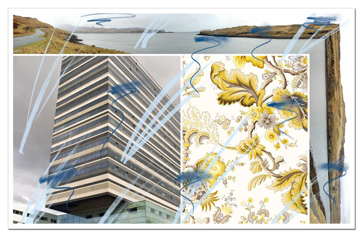
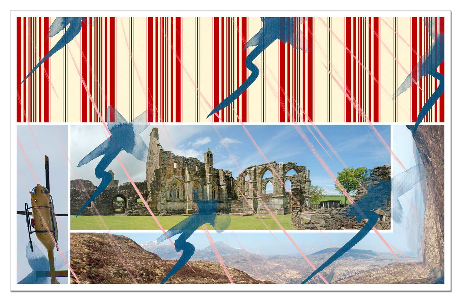
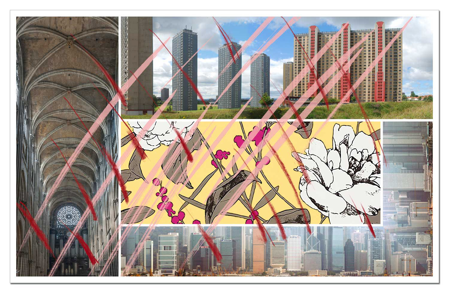
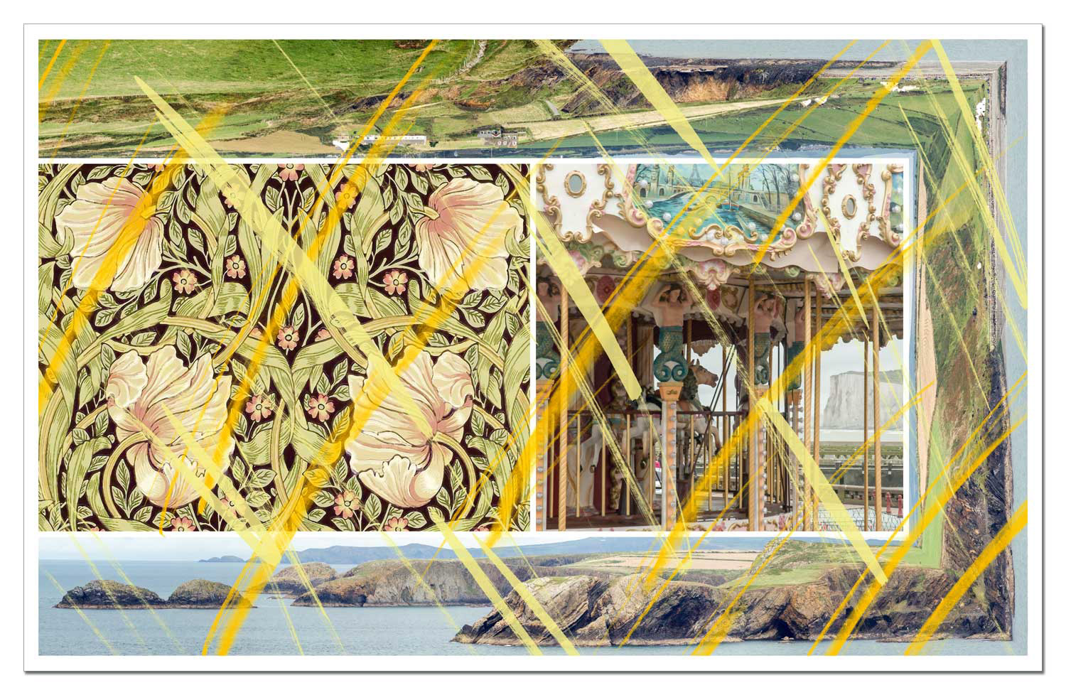
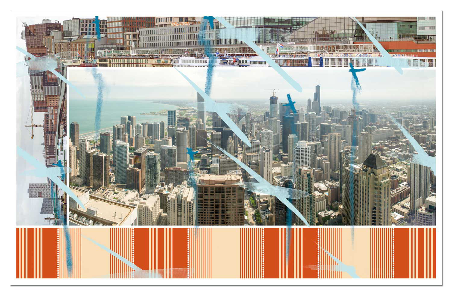
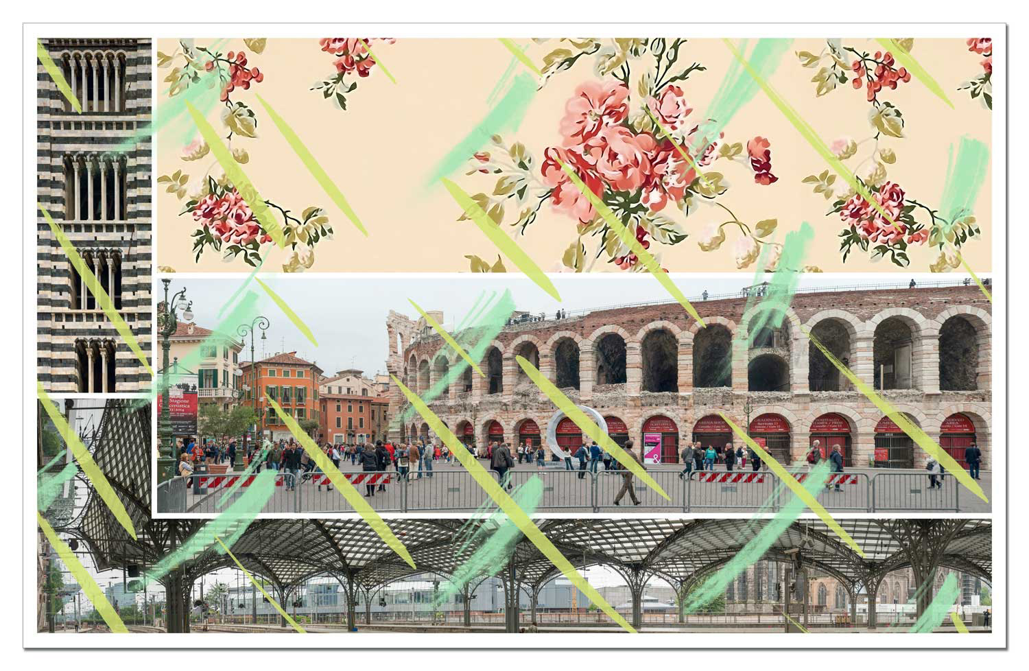
Access to Files is an extensive series of 120 pictures, organised in eight dossiers of fifteen files each. The starting point were tapestries in the Zeeuws Museum in Middelburg, whose central pictorial fields show historical naval battles of the 17th century, while the textile borders visualise the powers that commissioned these narratives: Patrons, institutions, political alliances. This double structure – a narrative image at the centre and a framing context – takes up the insight into the files and transfers it into a contemporary, digitally coded visual language.
At the same time, the title refers to the Freedom of Information Act, which guarantees state transparency towards citizens, as well as to data protection rights, which are intended to prevent the unwanted disclosure of personal information. The series moves between these two poles – public access and individual isolation – in terms of form and content.
The pictures follow a consistent structural logic: a central image field is framed by serial frame elements reminiscent of residential facades, technical grids or filing systems. Diagonal lines – which can be read as markings, barriers or folds – overlap the picture surfaces and fragment the visual unit. This creates a tension between visibility and encryption, between documentation and assertion. What begins as a photographic image becomes an ambivalent document through frames, grids and coding: legible and inaccessible at the same time.
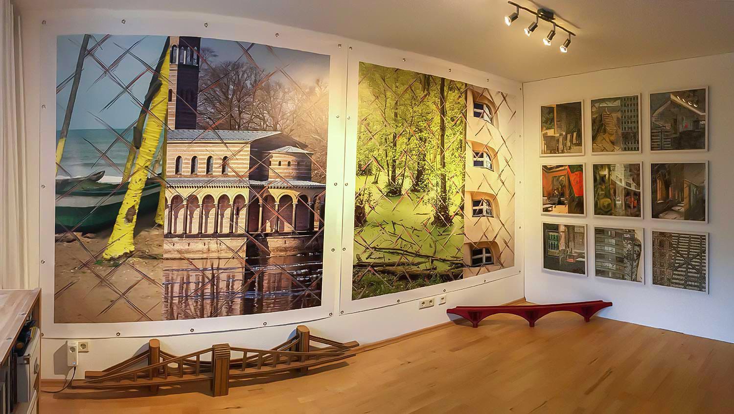
Access to Files is realised in two formats: as a wall-filling print (4.30m × 2.30m) on non-woven paper, which is wallpapered directly onto the wall, and as a digital print on paper in a smaller format (55cm × 35cm).
All 120 images from the File Inspection series are collected in an A5 format book – organised in eight dossiers of fifteen files each, supplemented by short reminiscence texts. The book is currently being redesigned and will soon be available in the shop.
In the accompanying book, the series of pictures entitled Access to Files is supplemented by eight short texts – one for each dossier. These texts are not commentaries on the images, but rather fragments of reflection, fragments of memory and thematic trails. They circle around historical, cultural and artistic fields that gained significance during the work on the pictures. Together they outline a network of figures of thought and contexts that frames the series without explaining it.
Dossier 1: A look back at the Dutch War of Independence and the Golden Age: the carpets in the Zeeuws Museum tell of revolt, colonial wealth and religious power. Economic liberalism as a forerunner of today's market logic also becomes visible.
Dossier 2: The 1968 Essen Song Festival – a radical festival between protest, pop and experiment. In the tradition of the Burg Waldeck festivals, it bridges the gap between political song culture and the psychedelic soundscape of the upbeat Krautrock.
Dossier 3: Two studios, two impulses: the Studio for Electronic Music at WDR and the Studio for Acoustic Art. Both locations promoted radical artistic formats – from Mauricio Kagel to John Cage – and show how much trust institutional funding requires.
Dossier 4: Exemplary support networks between galleries, festivals and artists: from Richard Demarco's pioneering work in Edinburgh to Konrad Fischer's Minimal Art exhibitions in Düsseldorf and the Italian gallery Tucci Russo, this is a panorama of committed art promotion.
Dossier 5: From the market mechanisms of 17th century Dutch painting to today's art fairs: The text sheds light on the economic framework of art production, from Rembrandt's workshop to Art Basel.
Dossier 6: Music television as a formative force: The Beat Club, Rockpalast and John Peel are described here as personal and collective places of remembrance of musical socialisation – between subculture and international networking.
Dossier 7: What can artistic research achieve? The text discusses the relationship between creativity, knowledge production and social relevance – and argues in favour of a self-confident role for the arts in the European research discourse.
Dossier 8: Three museums as places for contemplative art encounters: The Louisiana, the Kröller-Müller Museum and Voorlinden show how architecture, collection concept and landscape can merge in an ideal way – beyond hectic art spectacles.
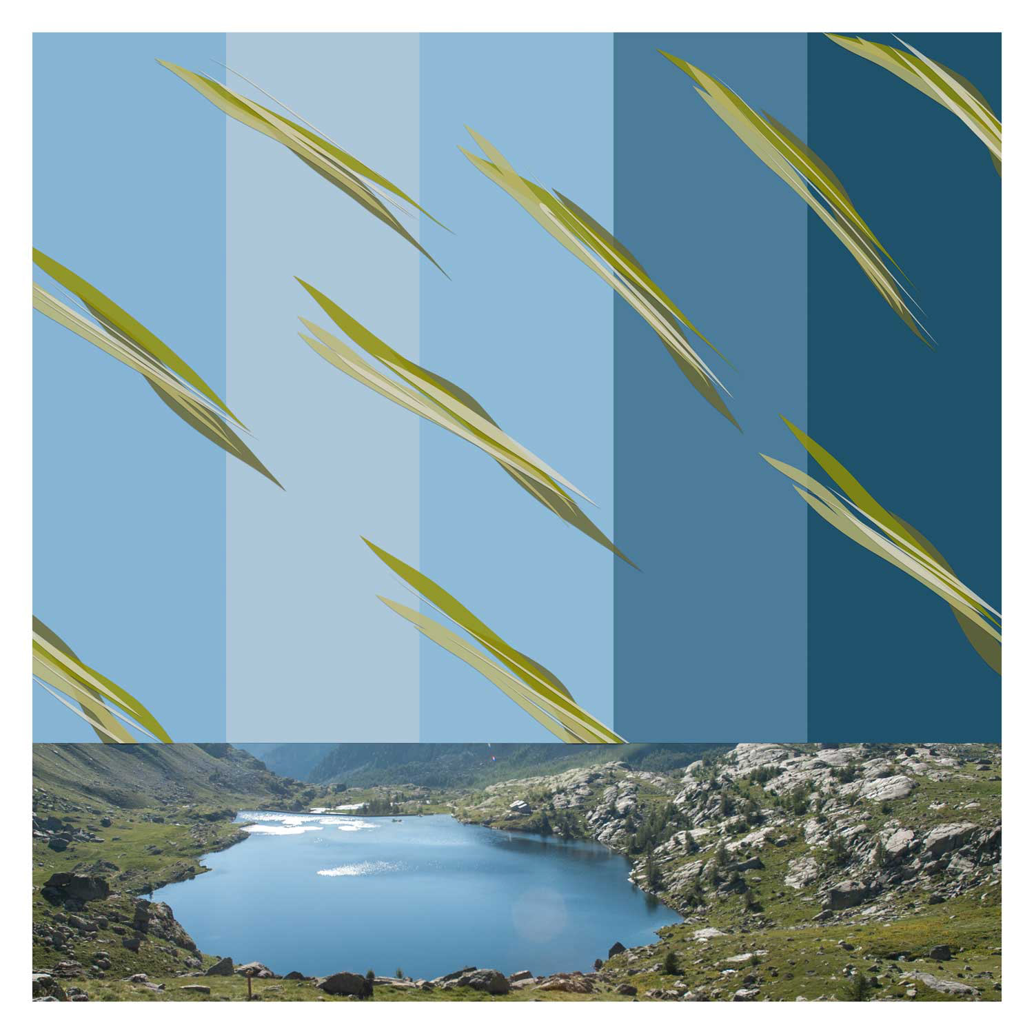
Book 5 - Levels of Distraction -2017
veiled and entangled
A clear view means orientation – and the freedom to let your gaze wander. An alert gaze remains in motion, always ready to react to surprises: to the sudden need to flee as well as to fleeting moments of beauty. A still gaze, on the other hand, misses opportunities – or falls for distorted, propagandistically charged images more easily. But what happens when the view is blocked? When the person in front of you in a traffic jam blocks the view, when the train window is covered in fingerprints, tags or advertising banners? Then the eye becomes sluggish, bored – and signals nausea to the brain. Attention turns away: to the newspaper, to the mobile phone screen, to aimless staring.
In 1974, in my second semester at the Düsseldorf Art Academy, I cleaned the completely dirty windows of the studio in Karl-Anton-Straße – not completely, just a rectangle. A clear cut-out that allowed a view of the ivy on the opposite gable. The first photographs were taken to document a supposedly small gesture.
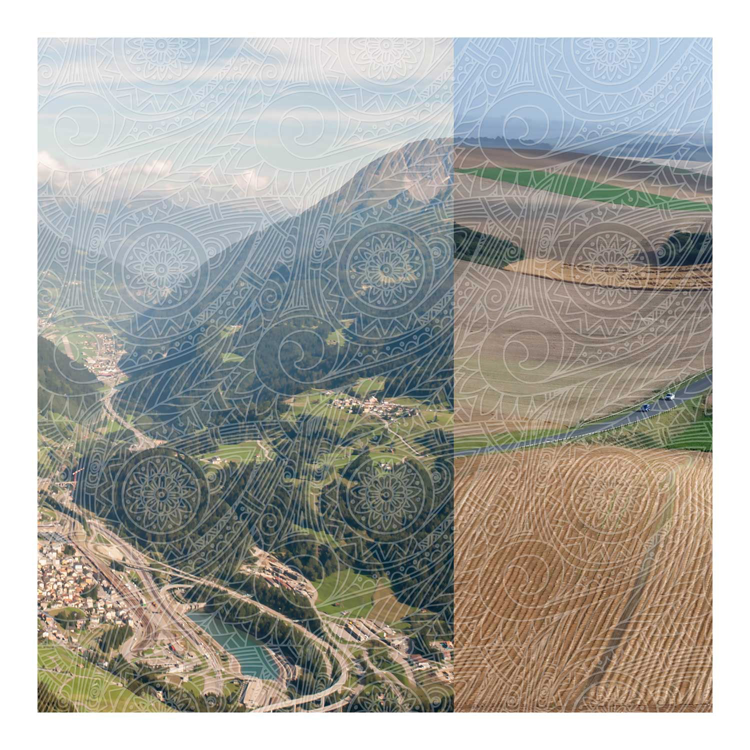
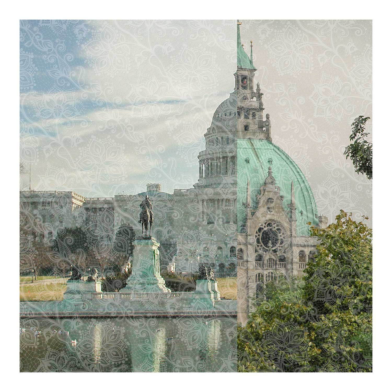
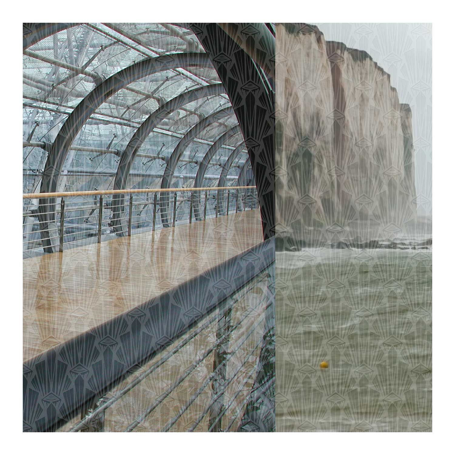
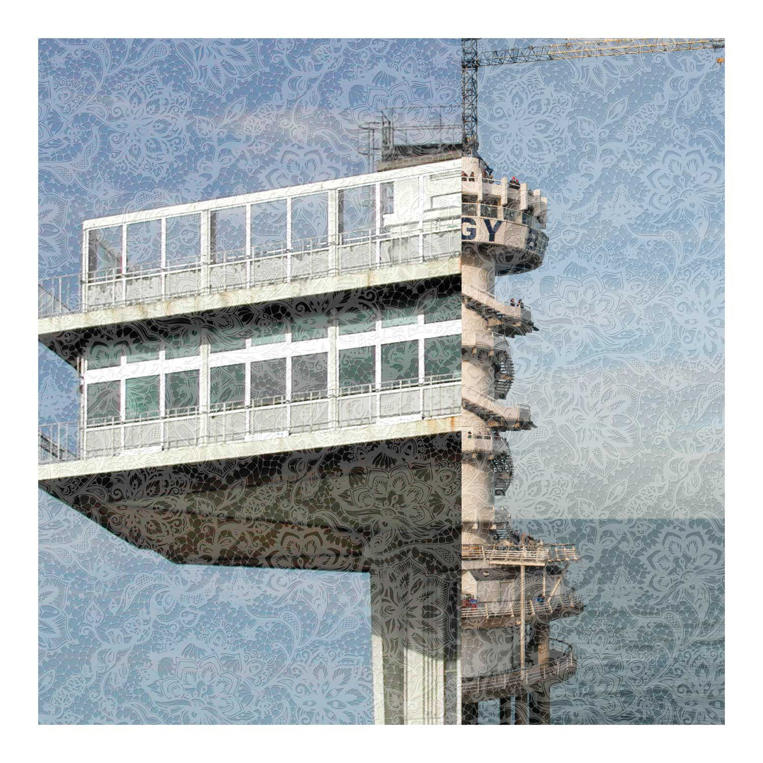
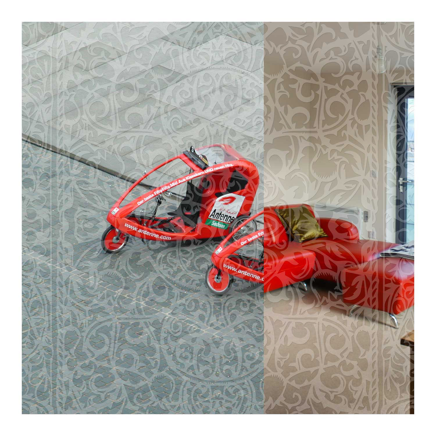
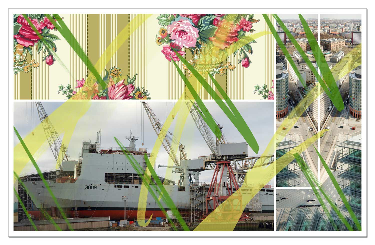
The series Levels of Distraction – verschleiert und verstrickt picks up on this moment of visual obstruction. The view of photographic combinations is deliberately obstructed – through superimpositions, digital shading and manual scratching. The degree of distraction that keeps interest alive is tested before the visual stimulus threshold tips over. After all, the ability to perceive near and far at the same time is a privilege – and an exercise.
Around half of the series is overlaid with digitally generated networks of lines: fragile, rhythmic meshes that do not block the view but guide it. The second half refers to historical lace patterns: ornamental structures that conceal, suggest, complicate. Lace can symbolise bourgeois confinement – or create erotic tension by showing just enough to mix curiosity, desire and the search for truth.
Behind the textures lie pairs of images: proximity meets distance, architecture from different times is confronted, inside and outside shift their meaning. The series comprises 80 sheets, realised in two formats: as wall-filling prints on vinyl tarpaulins (200 × 200 cm) and as fine art prints on paper (40 × 40 cm).
Each series follows an artistic strategy and develops diversity from the seemingly similar. Repetition creates rhythm – and carries individual tones into a melodic whole. A principle that creates patterns, establishes connections and hints at narrative structures. The fragments used deny superficial coherence – and yet allow new stories to emerge from the juxtaposition.
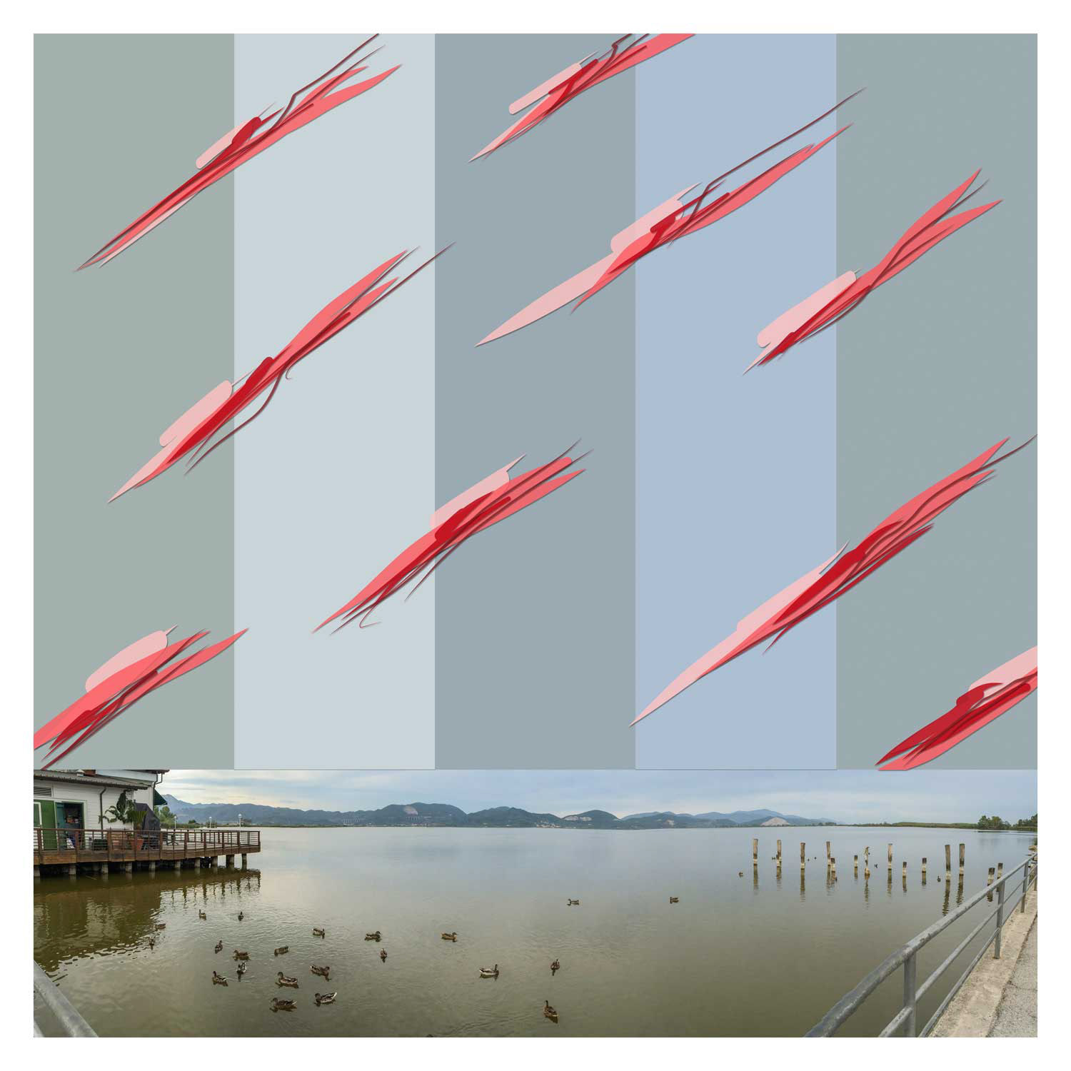
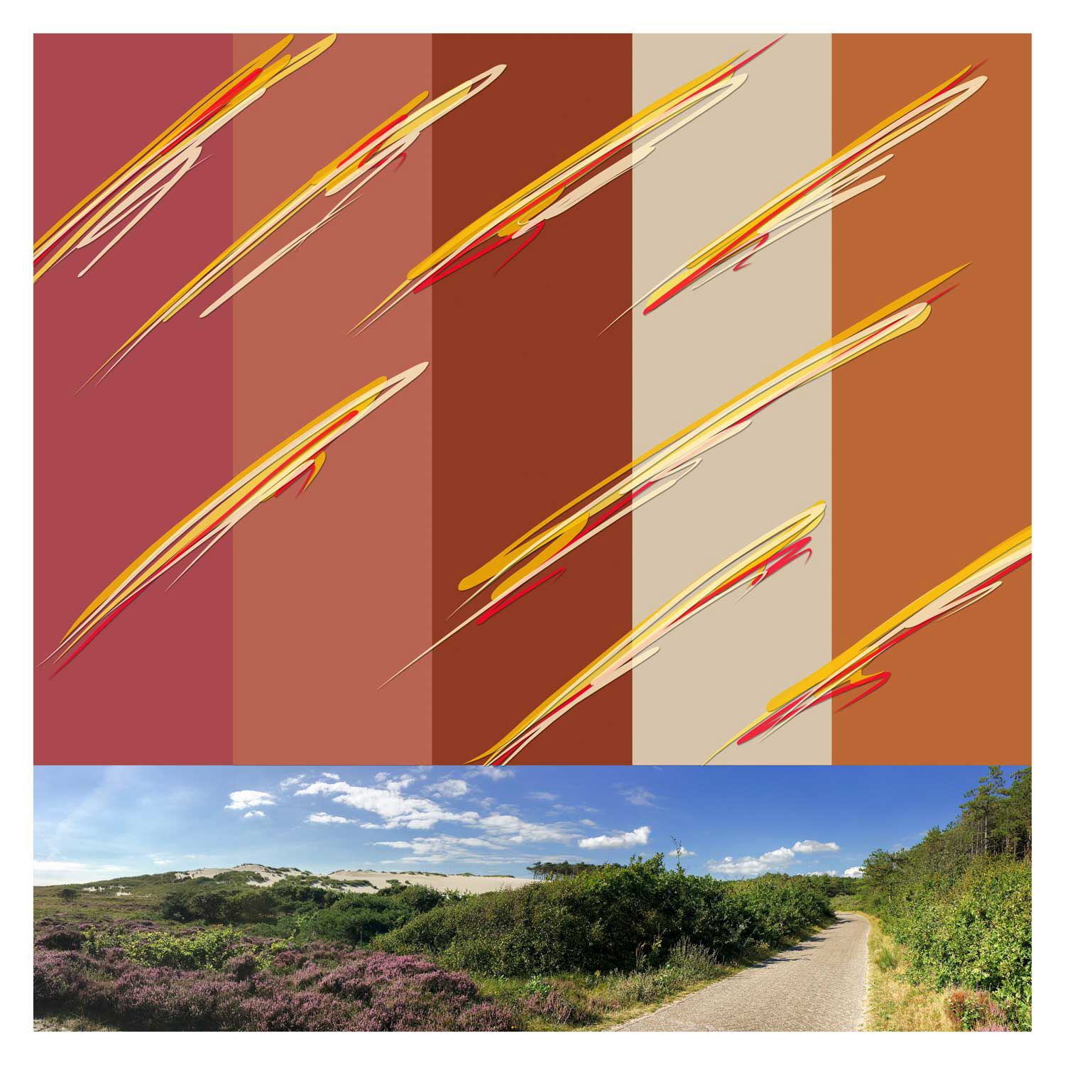
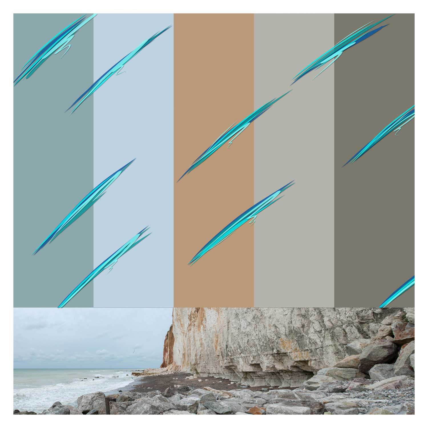
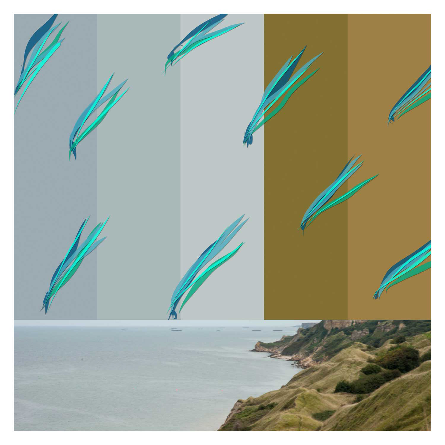
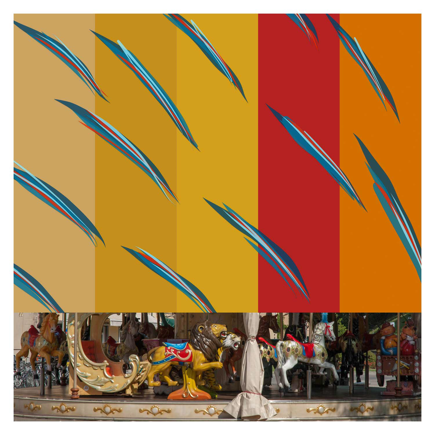
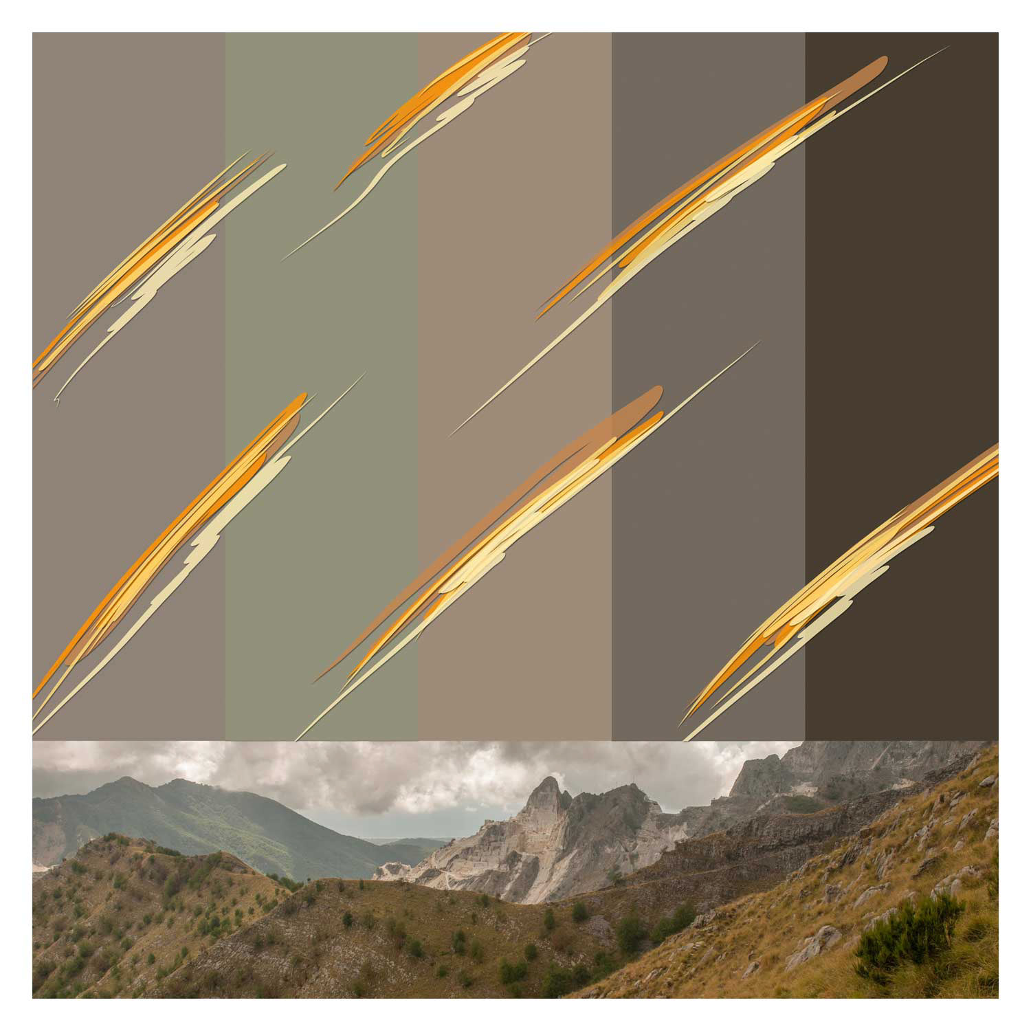
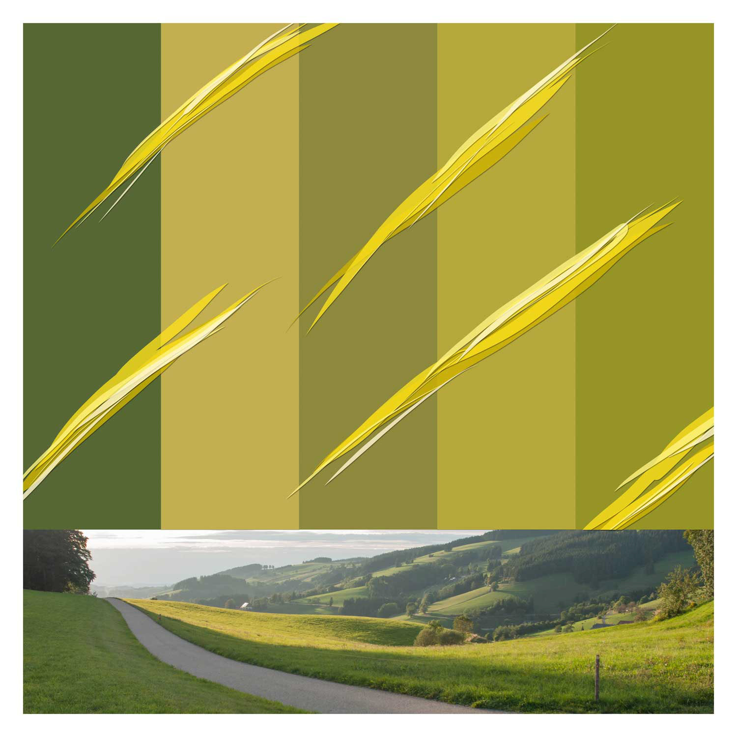
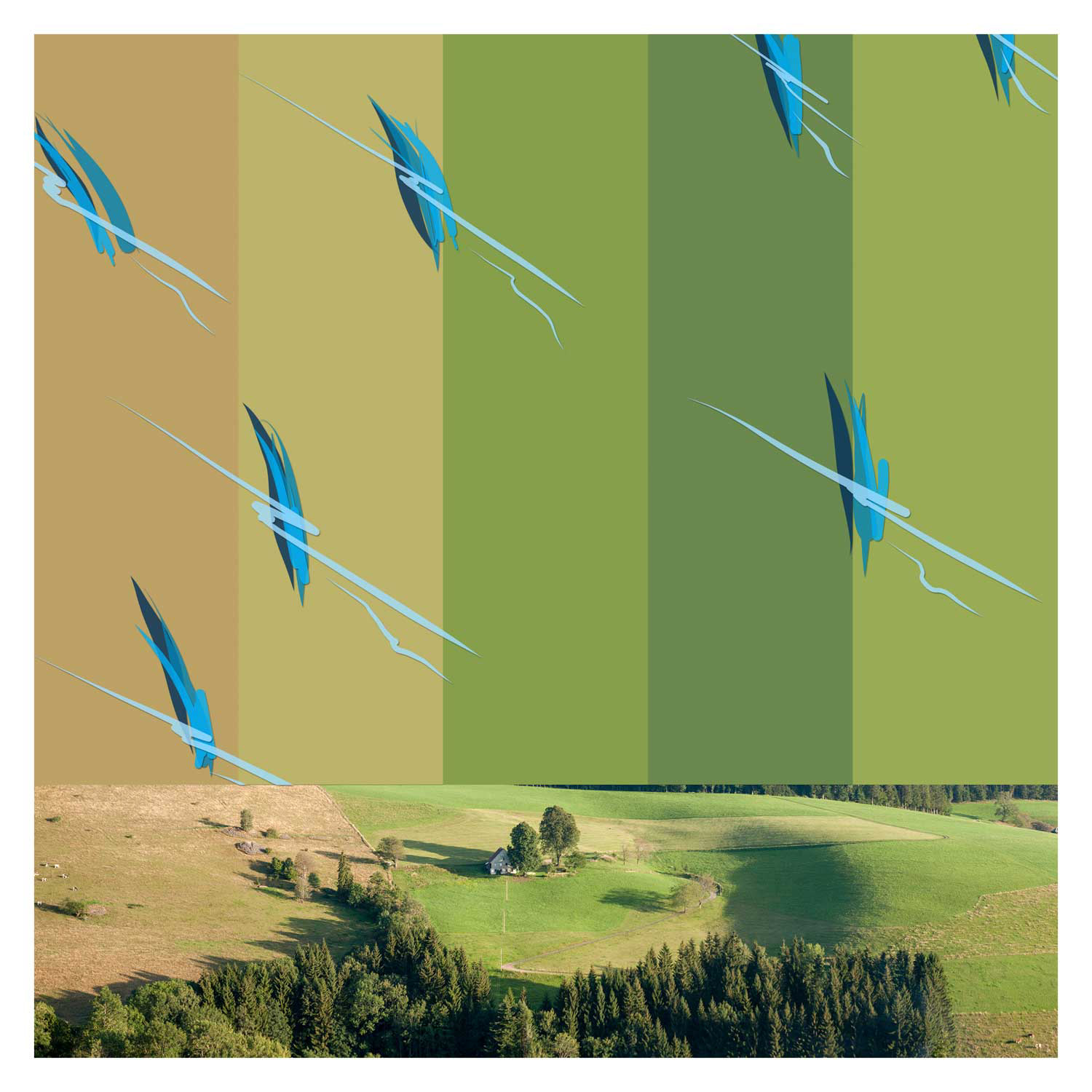
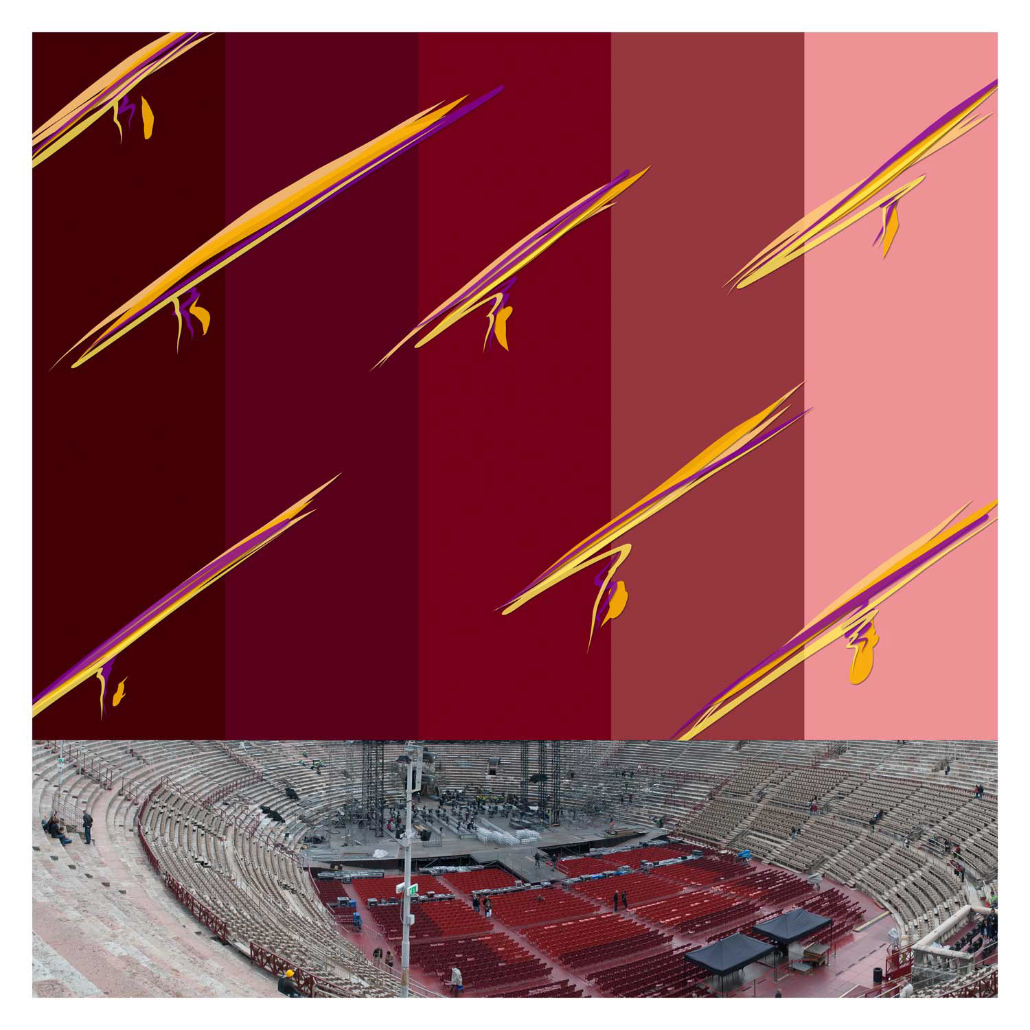
Book 4 - Irritable - 2016
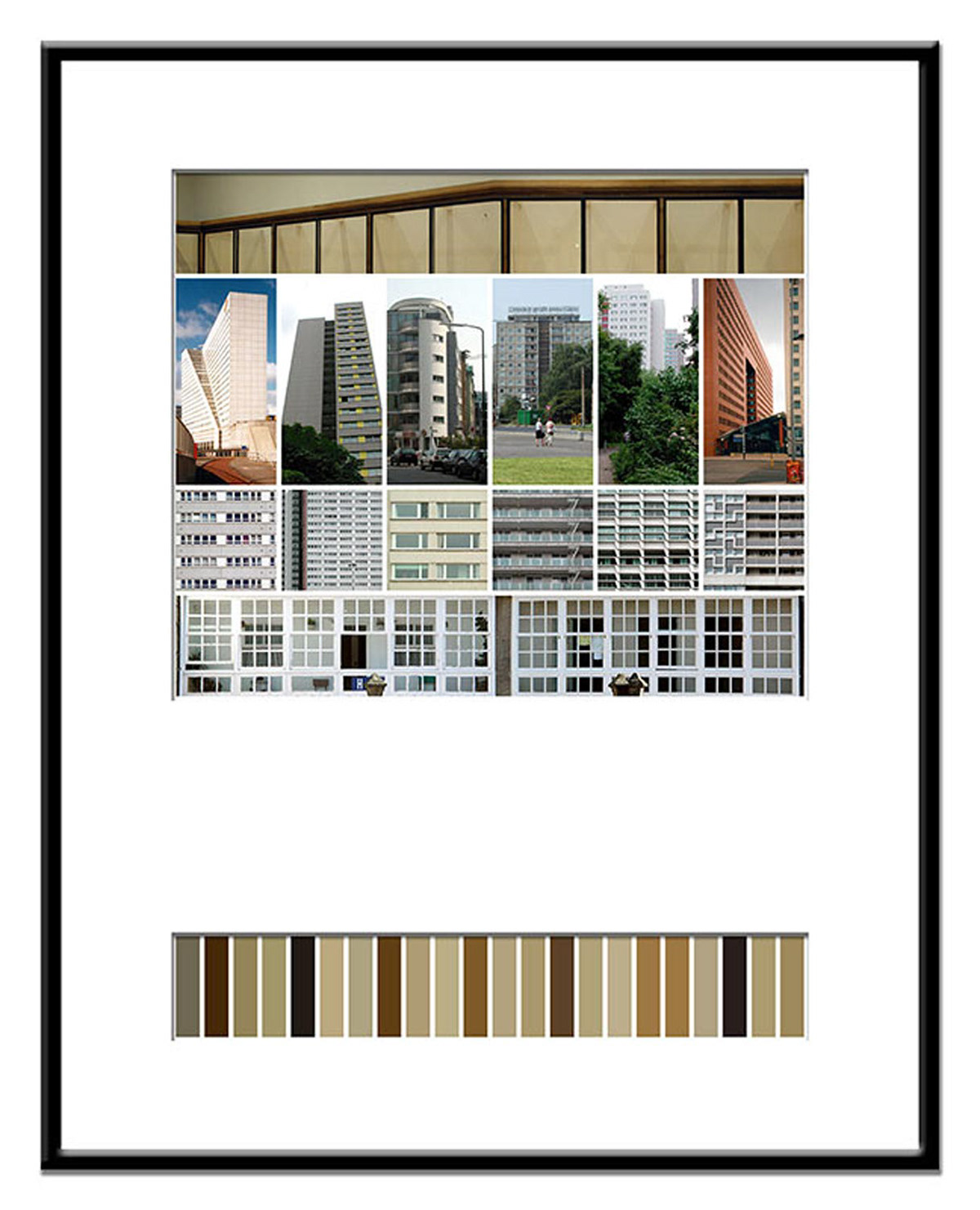
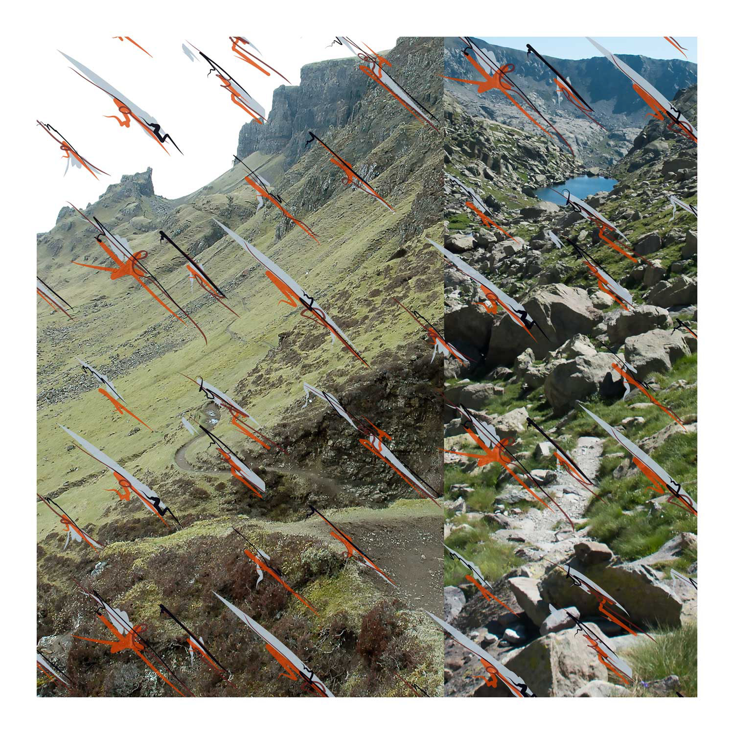
The Irritable series was created in 2016 and takes up a method that was already created in 2005 with colour coded: visual fields in which colourfulness becomes the coding of perception. In colour coded, 14 photographs were juxtaposed with 22 strips of colour – abstracted extracts from the image material, which were placed underneath like a vertical barcode. The categorisation was both analytical and poetic: seeing as categorising, extracting, transforming.
Irritable reverses this relationship. Now there is a narrow strip of photo at the bottom edge – as if the original image had been reduced to the minimum of its message. Above it: a coloured field in stripes, which on the one hand seems to be derived from the photo, but on the other hand is superordinate to it. The colours are no longer explanations, but independent visual protagonists. The code carrier has overtaken the coded.
As a third layer, digital drawings overlay the colour field – gestural, rhythmic, often transverse to the order below. They shadow movement, tension, irritation. The result is a threefold structure: photographic reference, colour abstraction, graphic entry. None of these levels dominates completely. They appear like figures in a triangular conversation – connected, but not in agreement. They struggle for weighting, negotiate attention, push each other into the foreground and background.
This formal triad refers to social transferability: the simultaneity of stimulus, reaction and reflection. The permanent coding of the environment, the superimposition of media structures, the constant balancing between interpretation, irritation and ignorance. Irritable thus becomes a psychological and political commentary – aesthetically condensed, but never clearly resolvable.
The series comprises 75 works, produced as digital prints on paper in 40×40cm format.
Book 3 - Second Opinion 2015
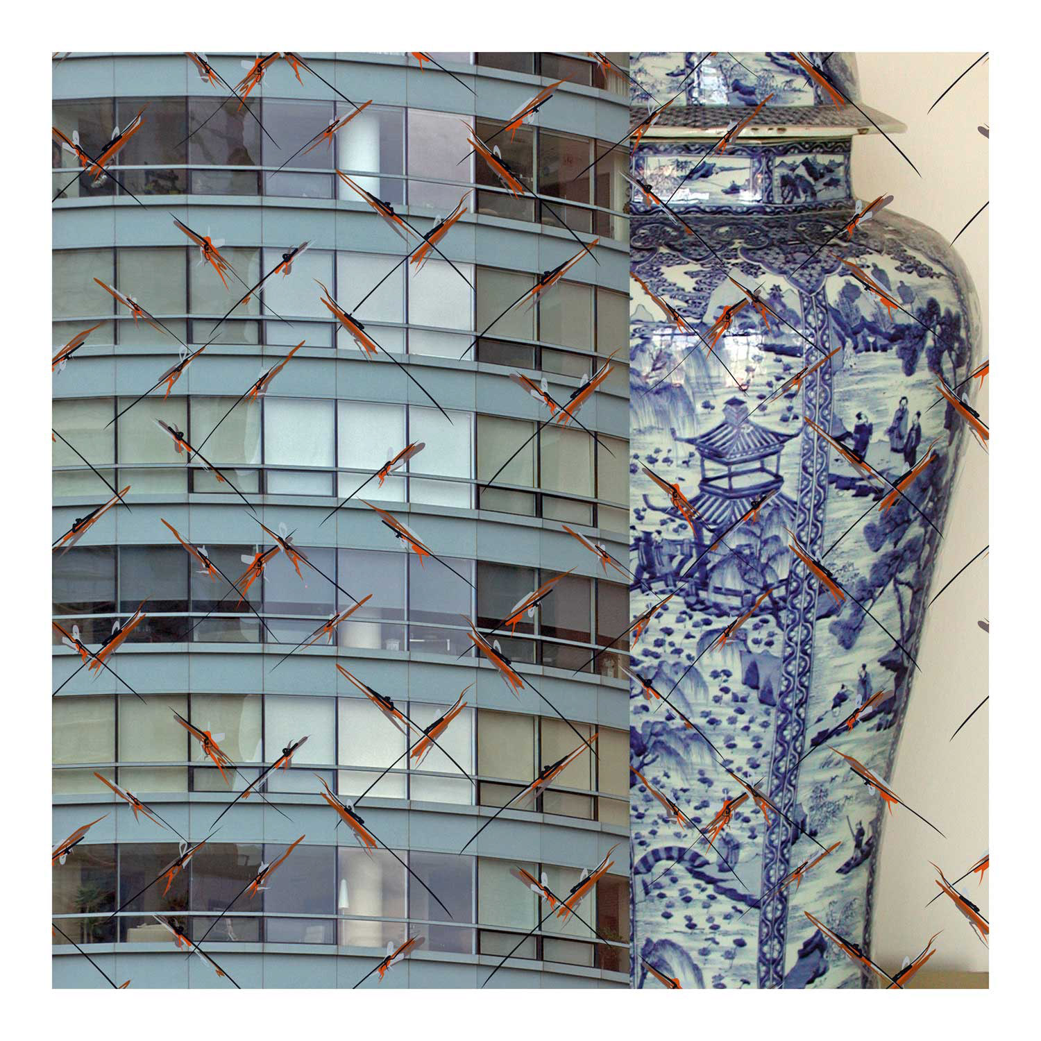
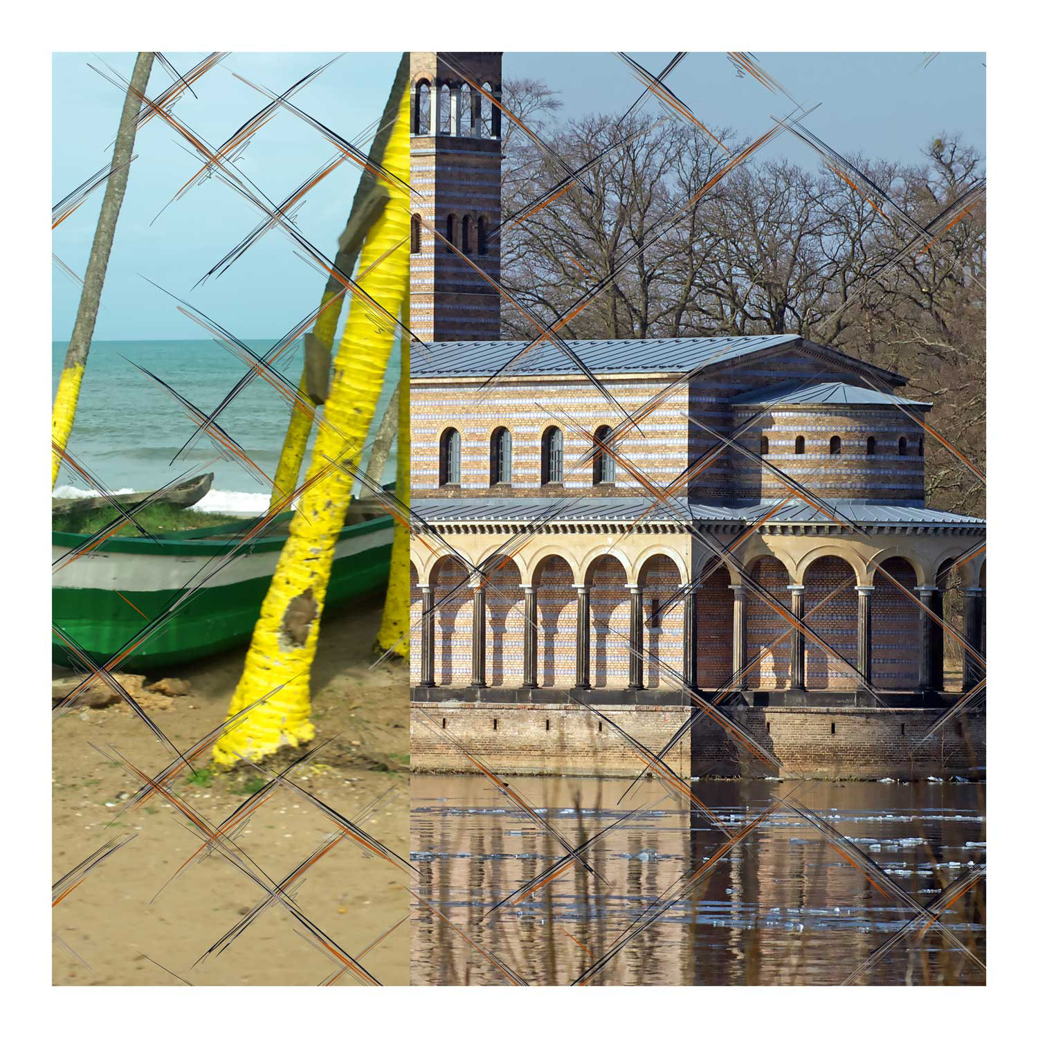
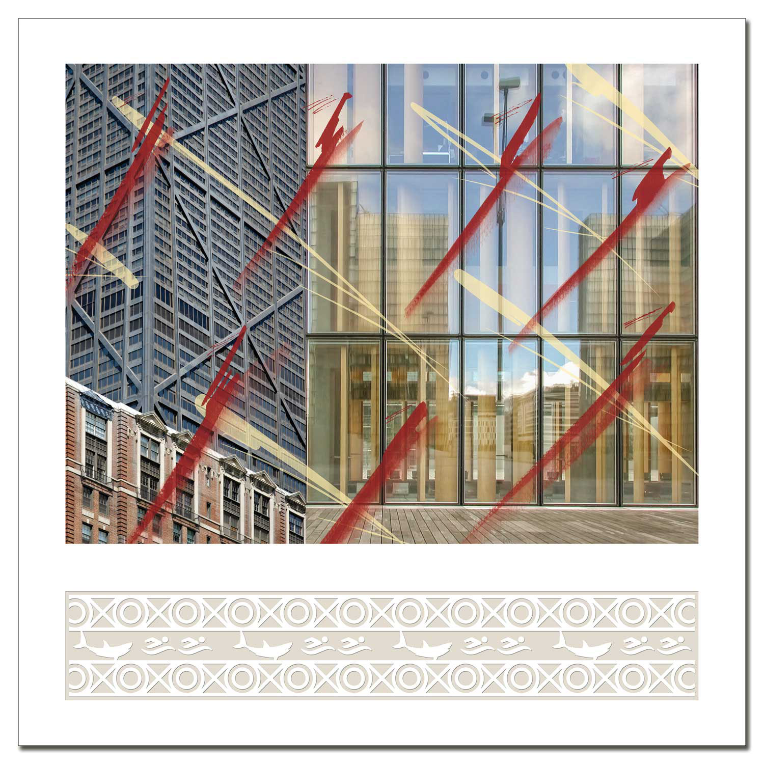
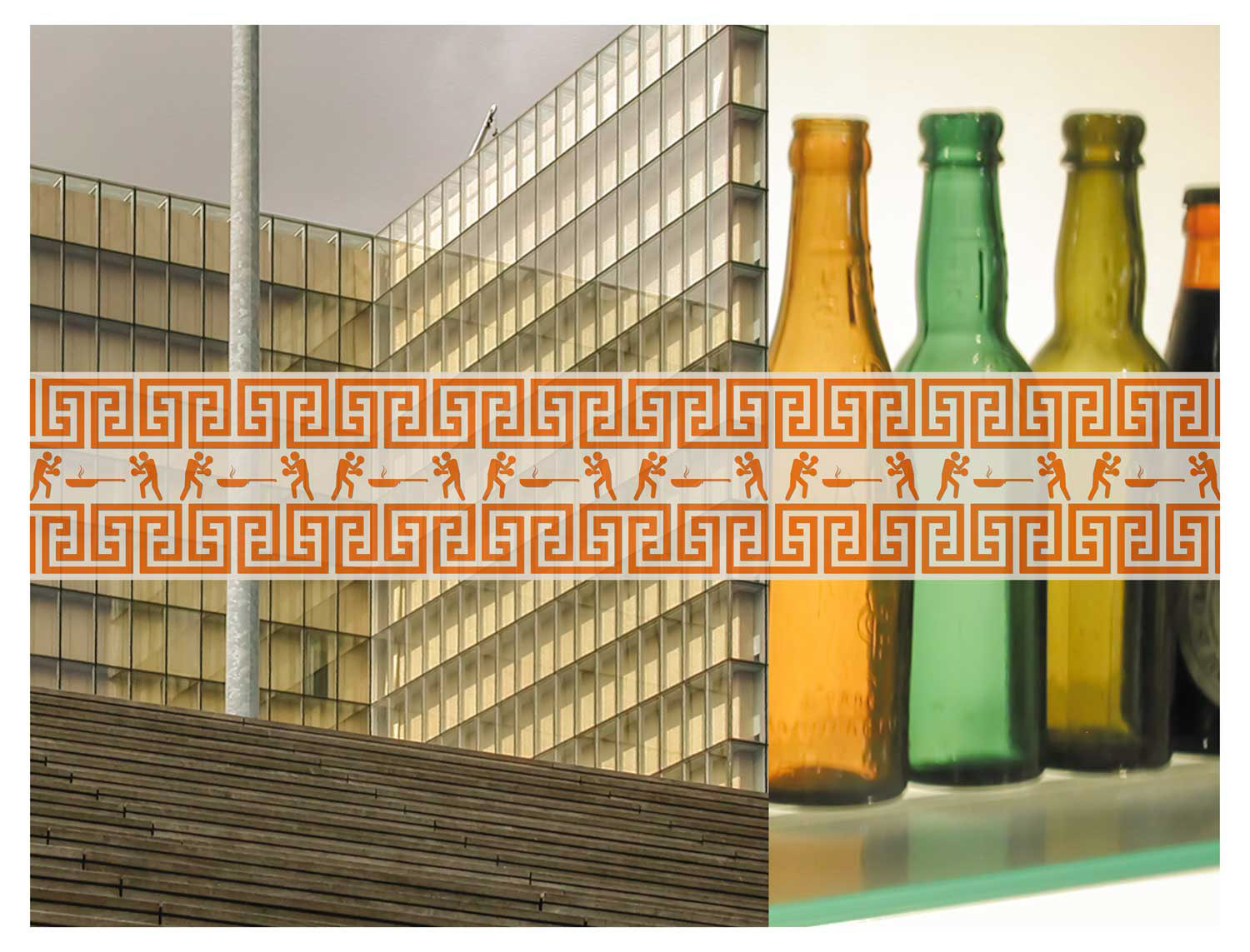
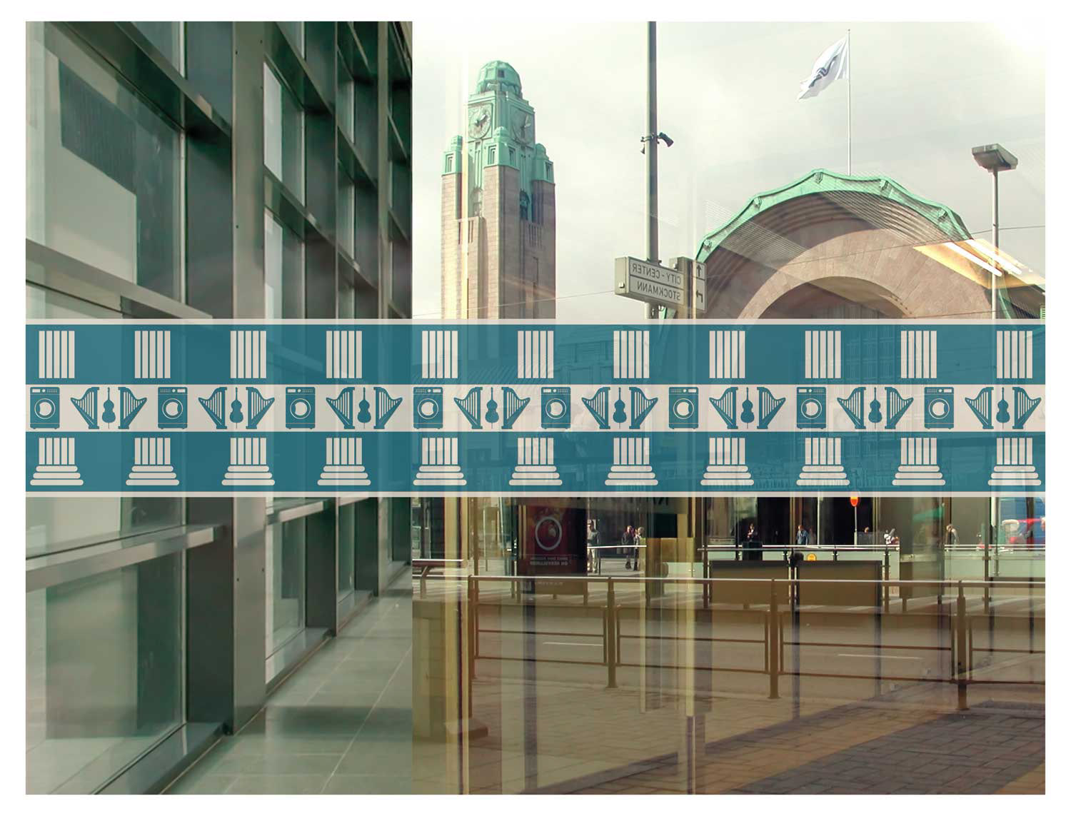
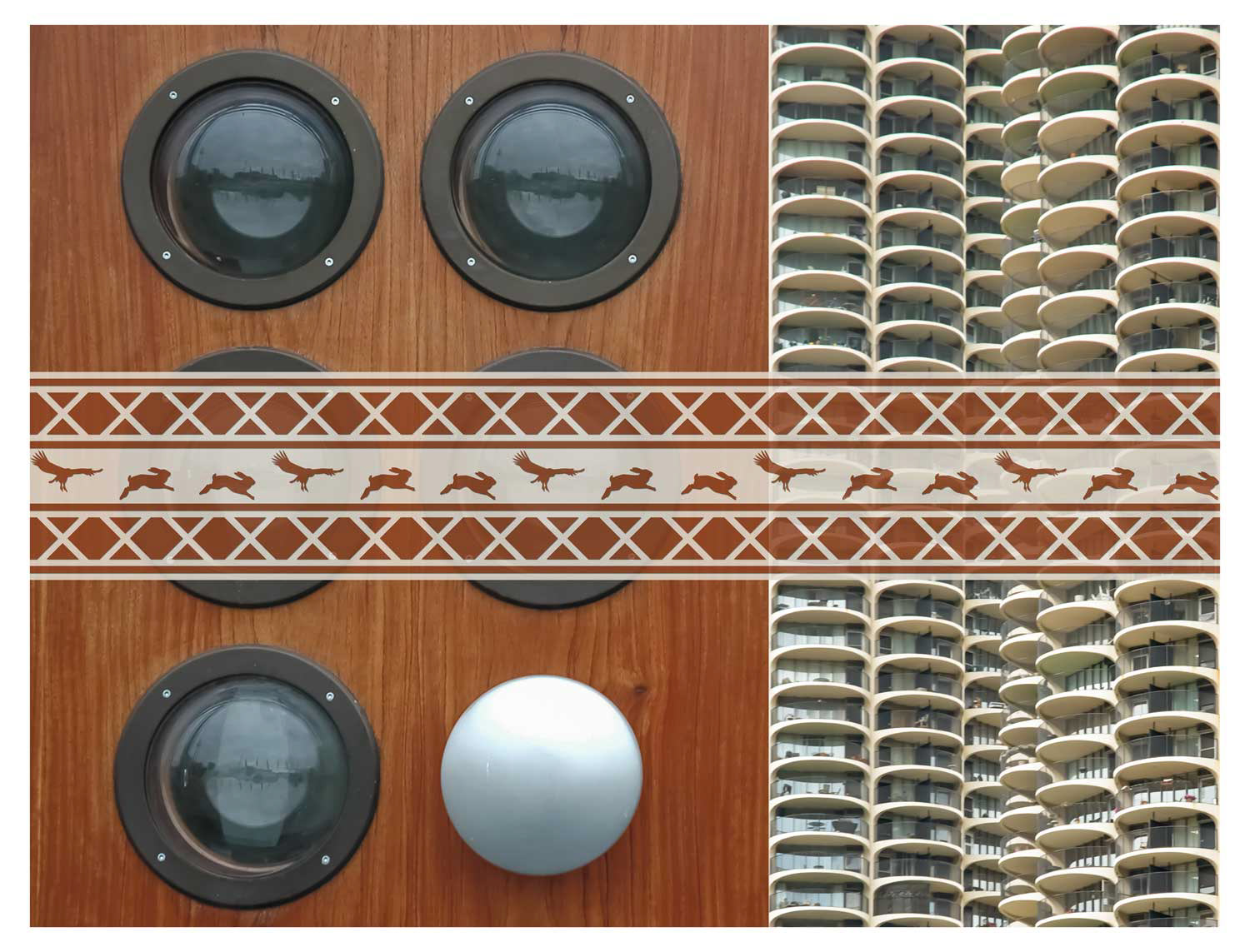
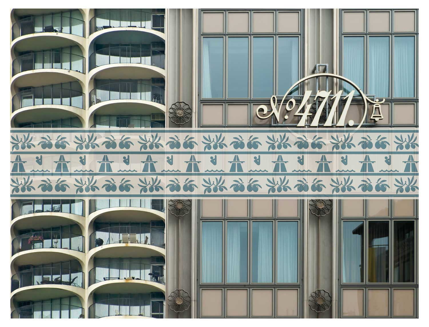
Second Opinion combines two photographs or sections in a fixed aspect ratio to create a new pair of images. Content-related references between the images are deliberately avoided – the combinations follow purely formal and compositional criteria. Lines, surfaces or lines of sight overlap, so that images merge with each other even though they were taken in different places and at different times. Sometimes depth is created by contrasting frontality and diagonals, sometimes a close-up view complements a panorama.
A graphic frieze is assigned to each pair of pictures like a signature or a commentary title. Two pictograms, which alternate rhythmically, run along a central strip framed by geometric ornamental bands – a reminder of classical architectural decoration. The narrative associations of these pictogram sequences are more reminiscent of the poetic chance strategies of surrealism than of classical visual language. They provide friction rather than legibility. Here, too, meaning is created through constellation, not intention.
Frieze-like elements already appeared in earlier works – for example as cut strips in light boxes from 1989 or as sculptural wood plaster friezes in installations from the 1980s. Second Opinion takes this principle further and expands it to include two additional layers of drawing. Two layers of drawings are superimposed over each pair of images. The graphic layers destabilise the photographic surface. They challenge us to understand what we see not as an image but as a construction. The series resists the reflex of reading photographs directly as documents and draws attention to the scope for perception, doubt and ambiguity.
The Second Opinion series was revised in 2025. The frieze strips originally placed below the picture surface were moved translucent over the picture – they now visually merge more strongly with the photographs and appear as an integral part of the composition. At the same time, the upper drawing layer, which previously floated above the picture as a hand-drawn line, has been omitted.
hovered above the picture. The new version appears more reduced, but no less complex: pictorial space, graphic order and narrative suggestion now intertwine more directly.
Second Opinion comprises 75 sheets in the format 40 × 40cm, printed as digital prints on paper. All works are collected in a book in 21 × 21cm format. The new version with the revised combinations is currently in progress – available soon in the shop.
Book 2 - Ledger: value added - 2015
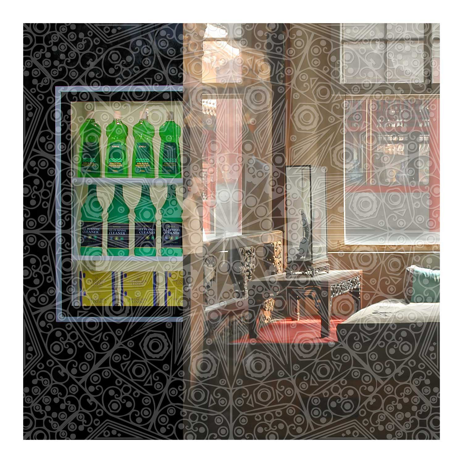
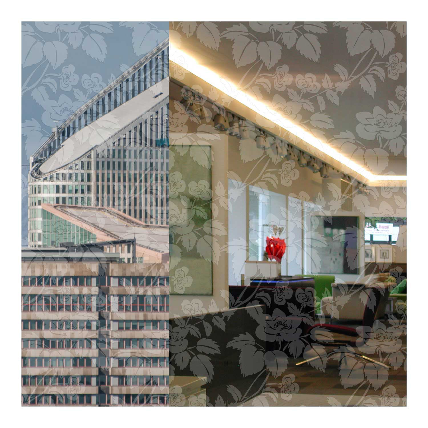
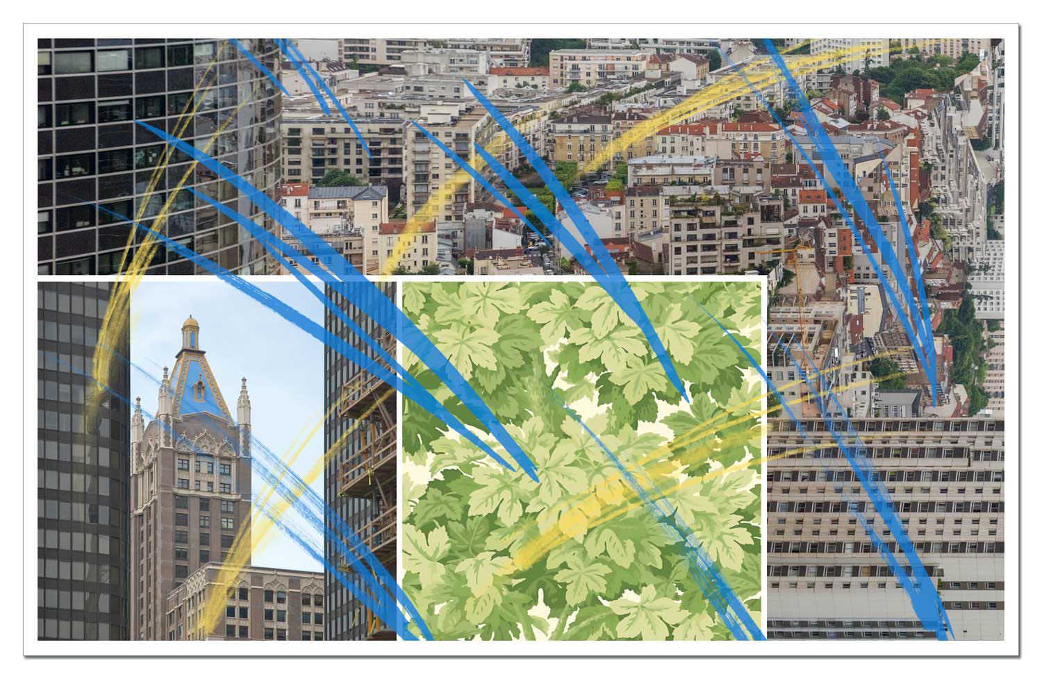
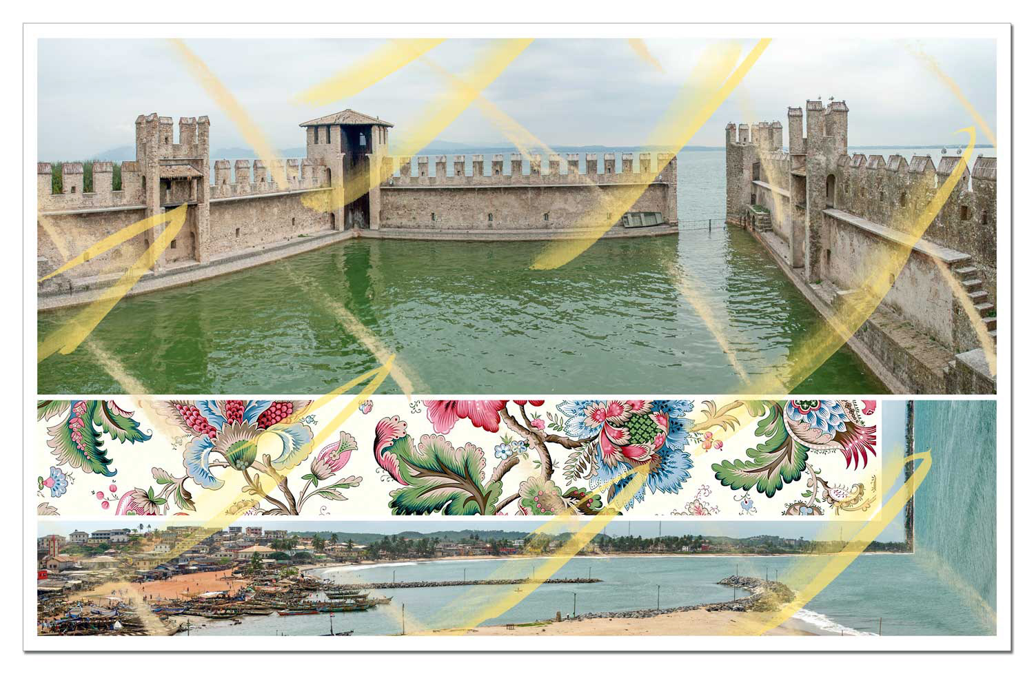
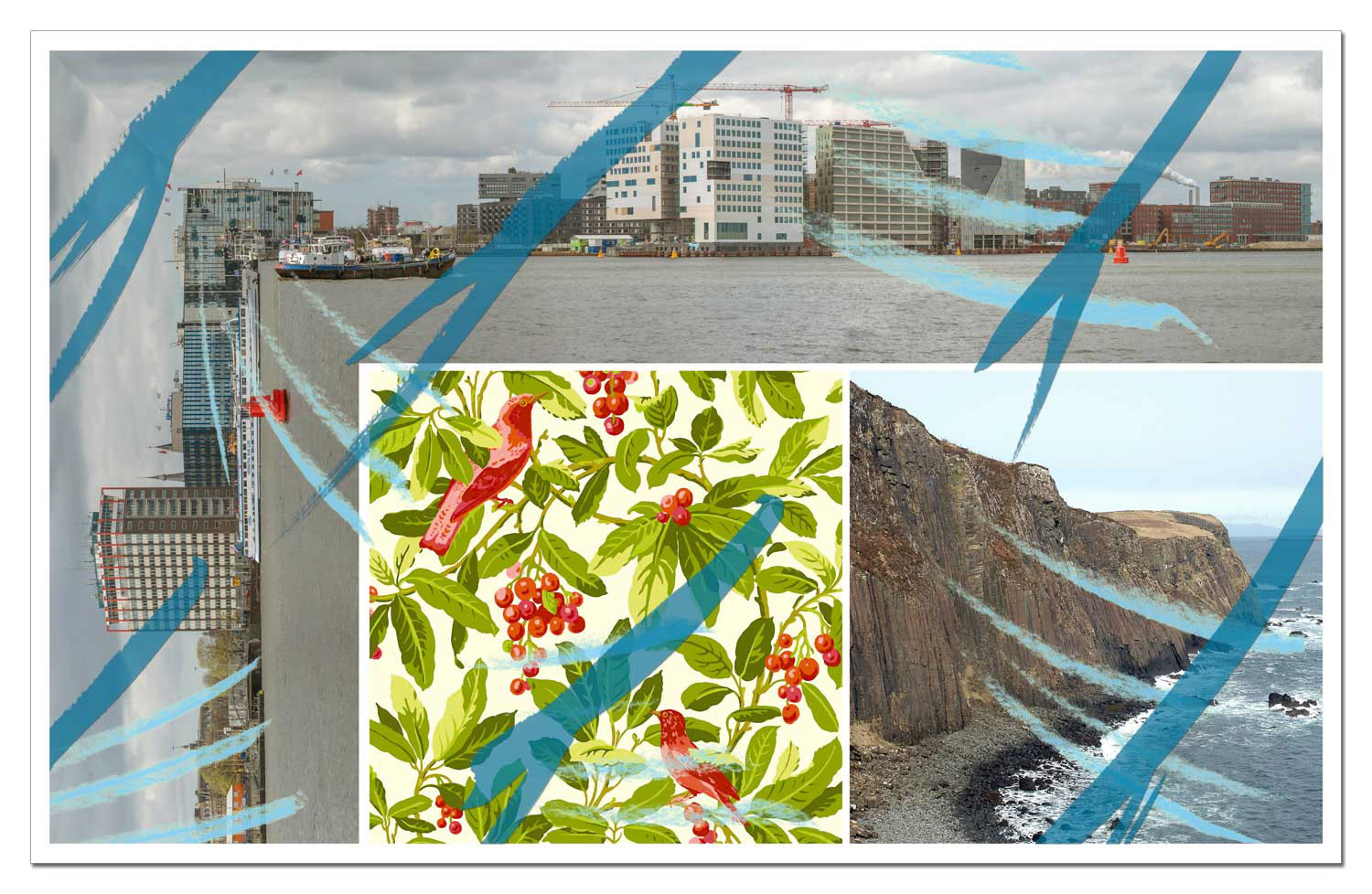
Ledger: value added brings together photographs taken in urban and landscape contexts. However, instead of focussing on the usual question "Where is this?", the series aims to dampen precisely this impulse. The aim is not to fixate prematurely on the categorisation of a place, but to oscillate between overall view and detail – an interplay that enables a deeper understanding of visual, social, political or cultural contexts.
The panoramic images are bent, mirrored and recombined – without regard for geographical or thematic continuity. The documentary potential of the images is deliberately disturbed by inserting wallpaper patterns and hatching drawings. This destabilises the view, but at the same time invites us to linger longer and develop our own – unplanned – narratives.
How far can the need for categorisation be pushed back without dissolving the sense of the image? And can a new approach to image perception emerge in the oscillating vision between overview and detail? Ledger: value added explores these questions with the aim of giving photographic images a new confidence – beyond interpretation and manipulation.
The series consists of 75 sheets, produced as digital prints on drawing board in 100×70cm format.
The book of the same name comprises 160 pages in 21.5×15.5cm format. It is currently being revised and will soon be available in the shop.
Eight Albums - 2010 – 2014
Eight Albums marks the transition to digital image works, but at the same time takes up compositional strategies from earlier sculptural and installation works. The collection comprises eight albums that take up and further develop experiments created between 2009 and 2014. The starting point is an archive of over 25,000 photographs – mostly taken while travelling – that show architectural and landscape situations in panoramic formats or detailed sections.
Each album follows a fixed layout principle and combines two to sixteen photographs to form a picture sheet. The design framework varies from album to album, but remains constant within a series. Coloured stripes are introduced as an additional visual layer: They are not used for decoration, but act as a deliberate distancing from photographic illusionary spaces. They emphasise the constructive nature of the composition and remind us that every photographic reality also harbours questionability.
Although the selection and arrangement of the images touch on aspects of content and location, they avoid narrative links. Instead, the visual potential of the pictorial fields takes centre stage – as free constellations that defy linear interpretation. Between order and deviation, structure and intuition, Eight Albums unfolds a formal continuum of variation, repetition and dithering.
The eight albums invite the viewer to see between overview and detail. They make it possible to experience how individual photographic images can be transformed into complex pictorial spaces – as sheets, books or wall works that always rely on the principle of the serial and the fragmentary.
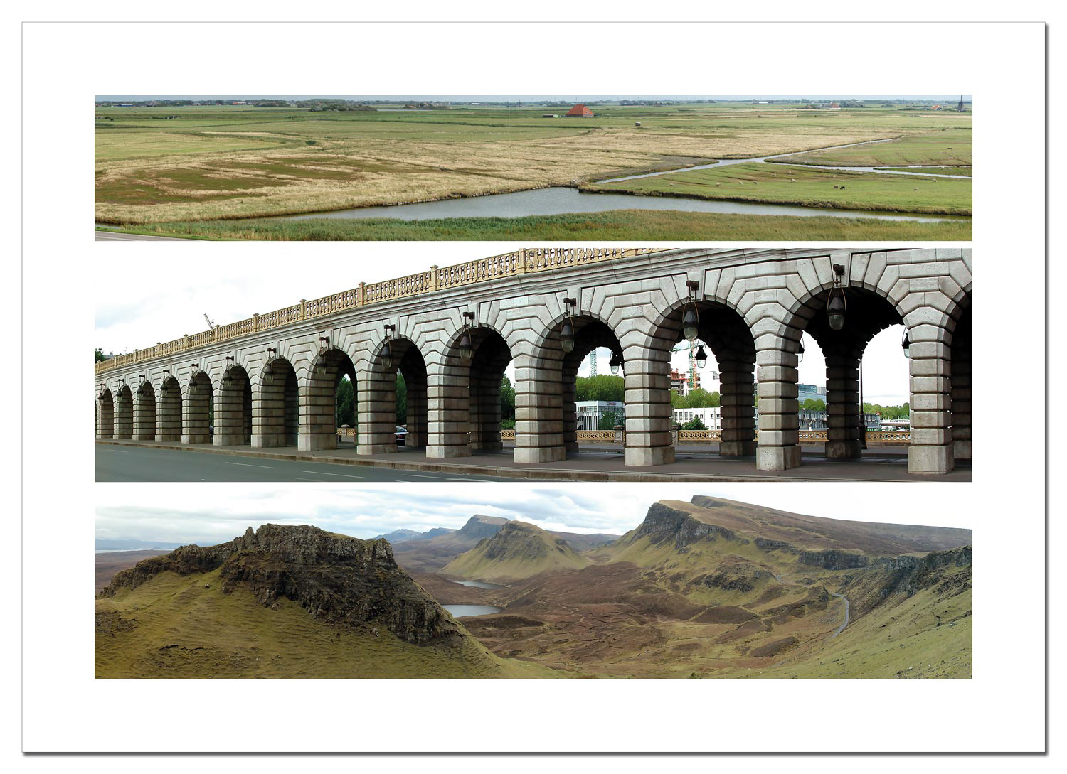
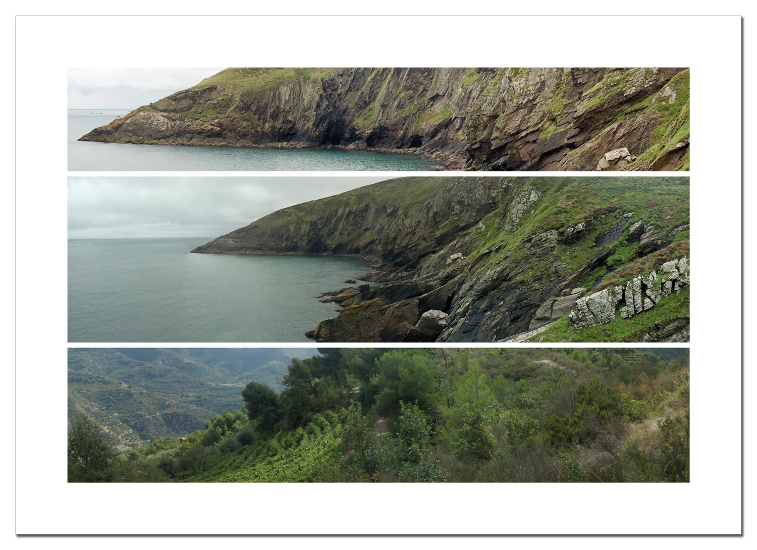
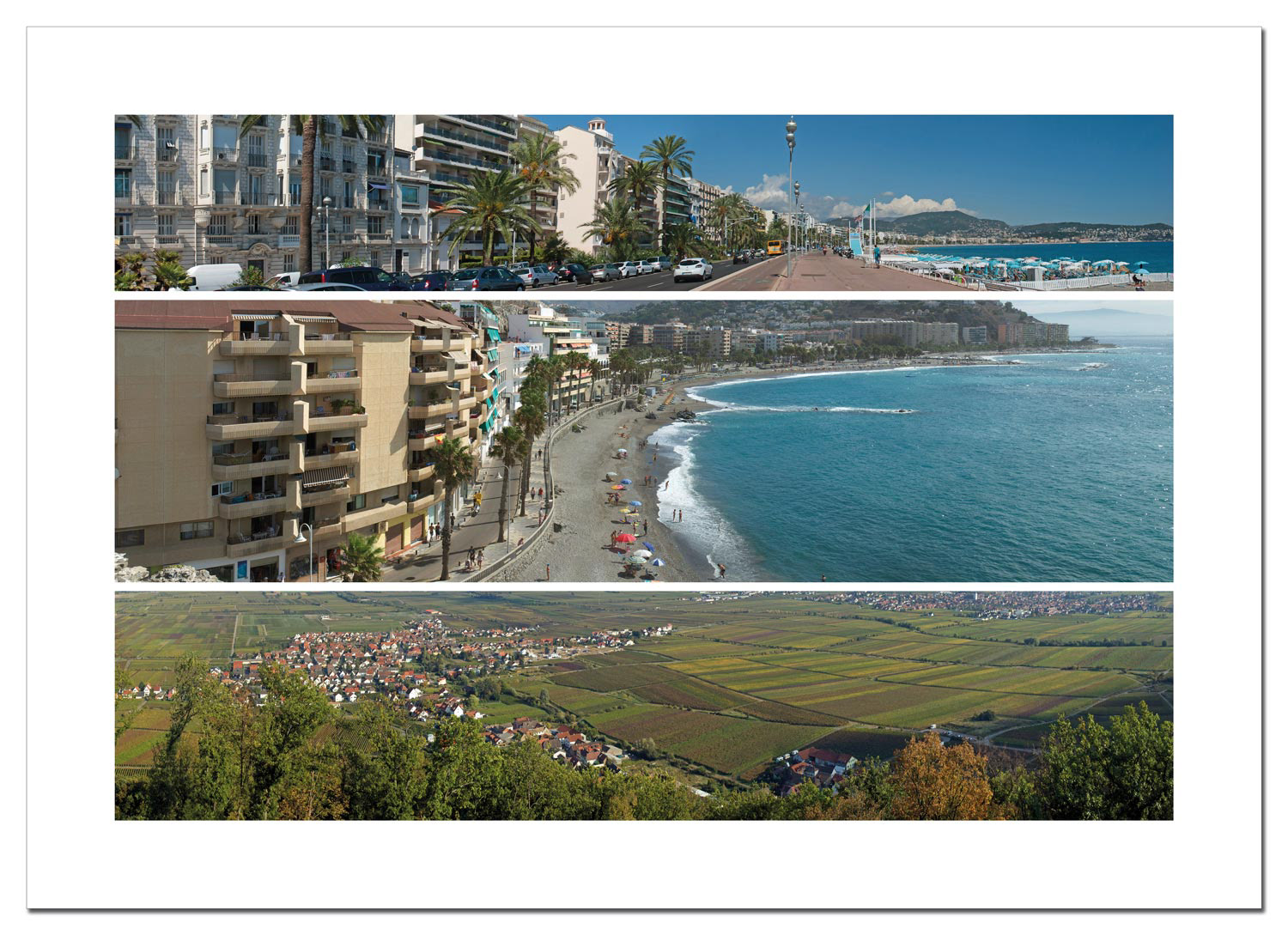
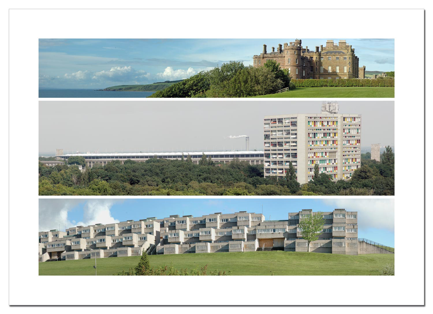
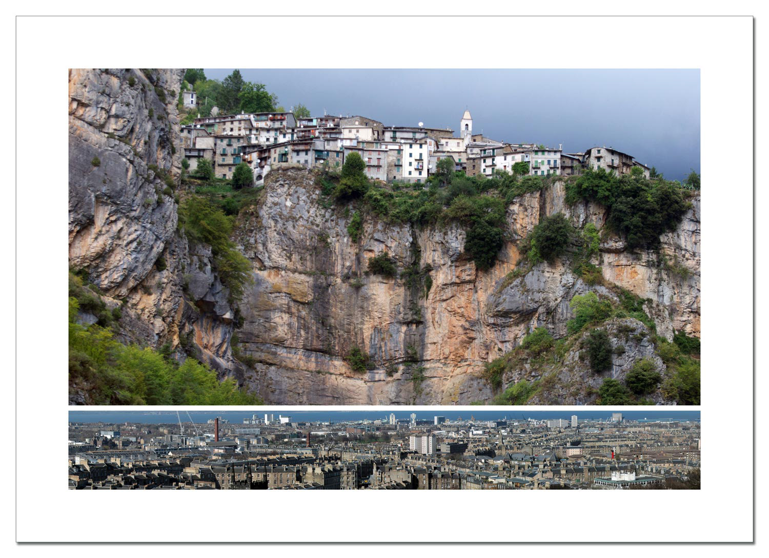
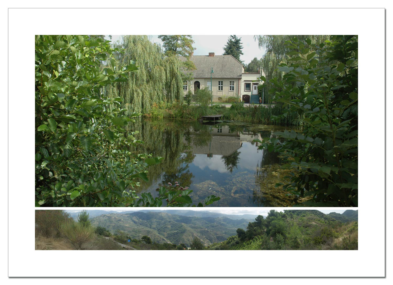
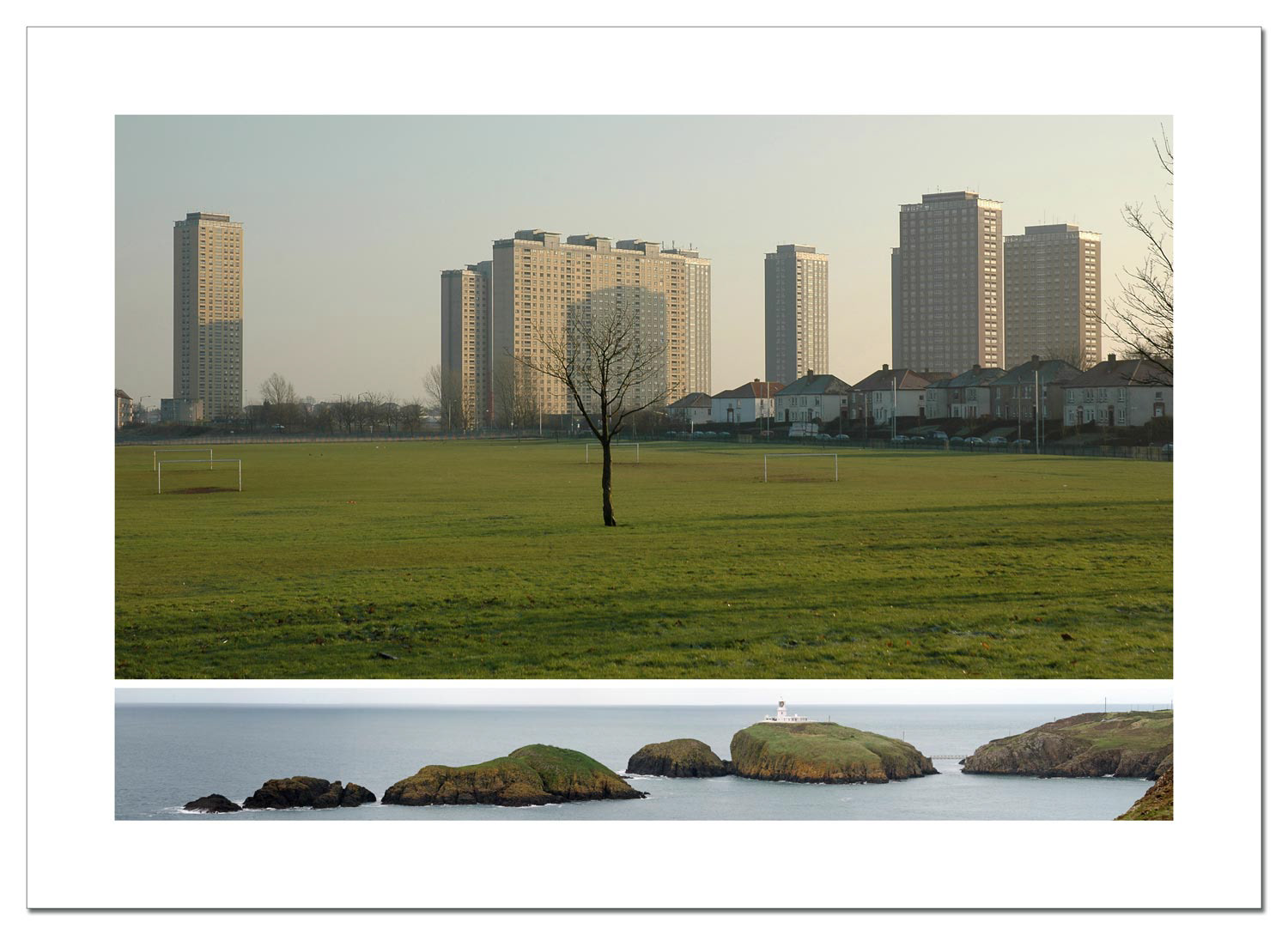
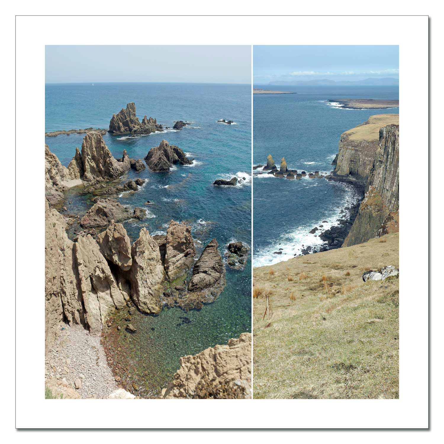
Album One - balanced - 2010
Balanced was created in 2010 and marks the start of the series of eight albums. It comprises 23 sheets, on each of which three longitudinal panoramic photographs are arranged one above the other in fixed, harmonious proportions. The formal rigour of the composition opens up surprising correspondences in terms of content – without any narrative intention.
The sheets have a format of 100× 70cm and are realised as framed photographic prints. All 23 works are documented in the anthologies Eight Albums. The two volumes are published in A5 format, in a limited edition of 100 copies, and are available in the shop.
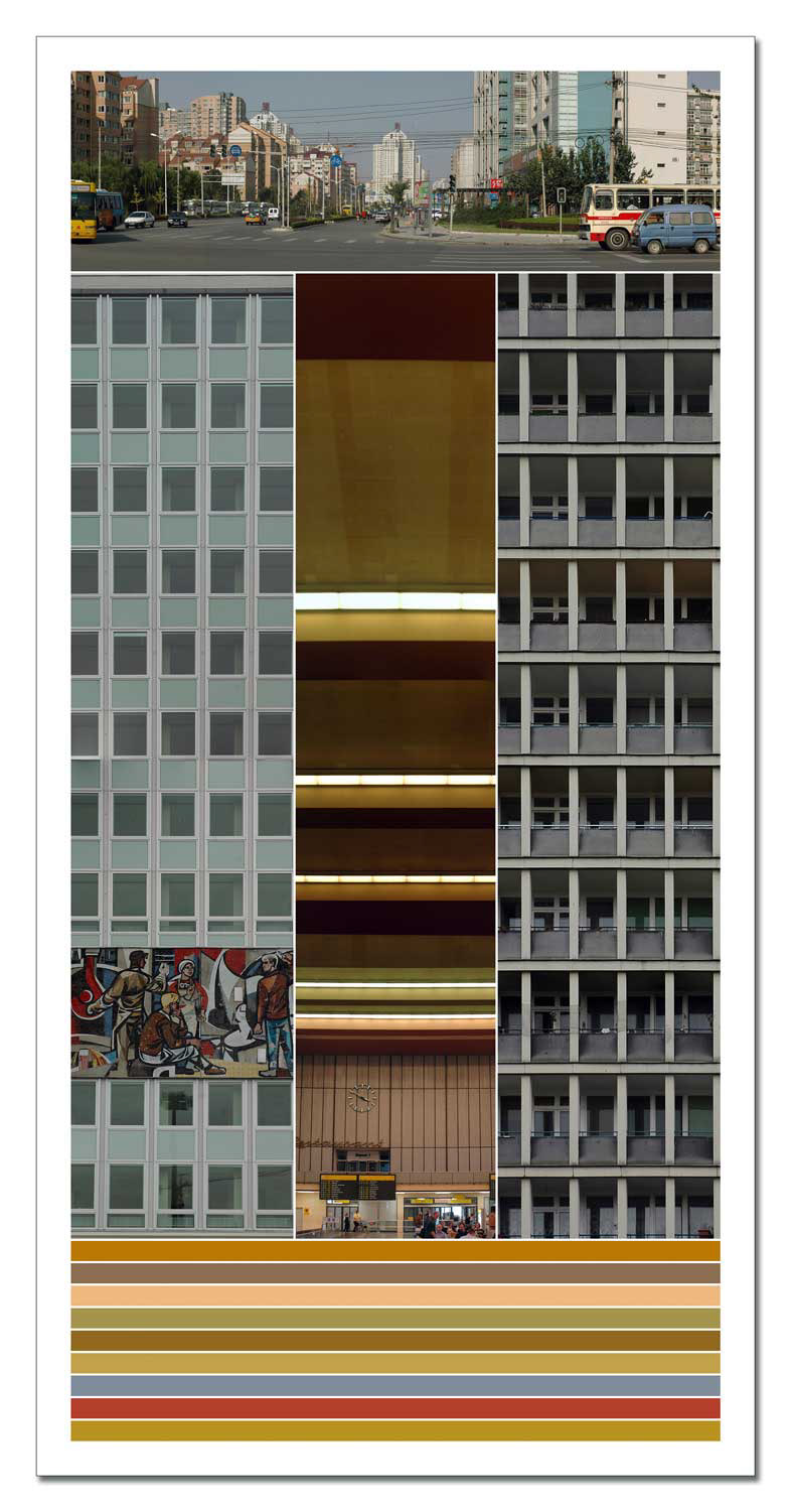
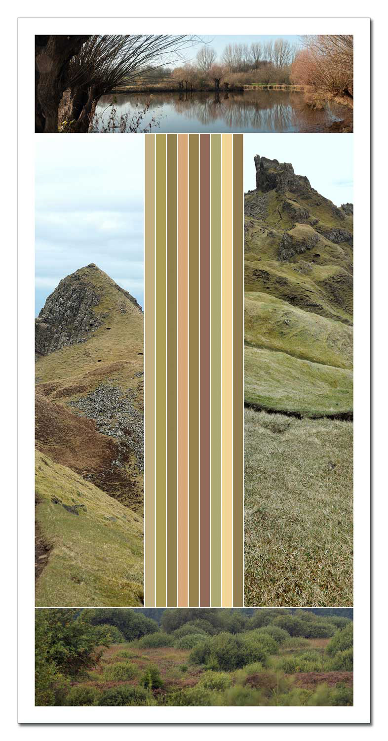
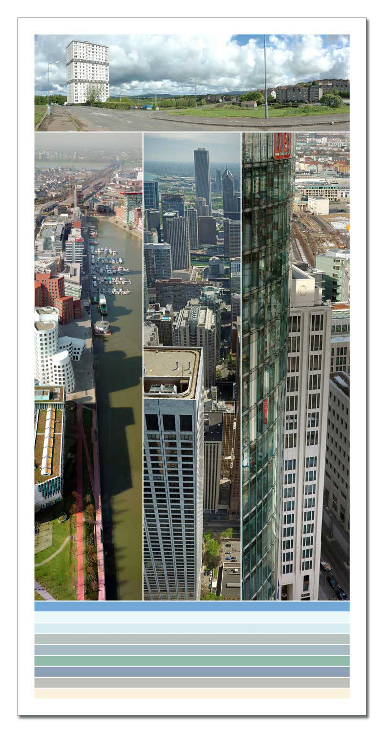
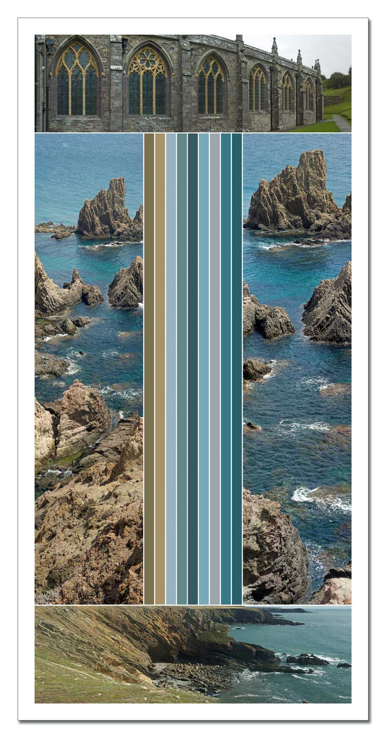
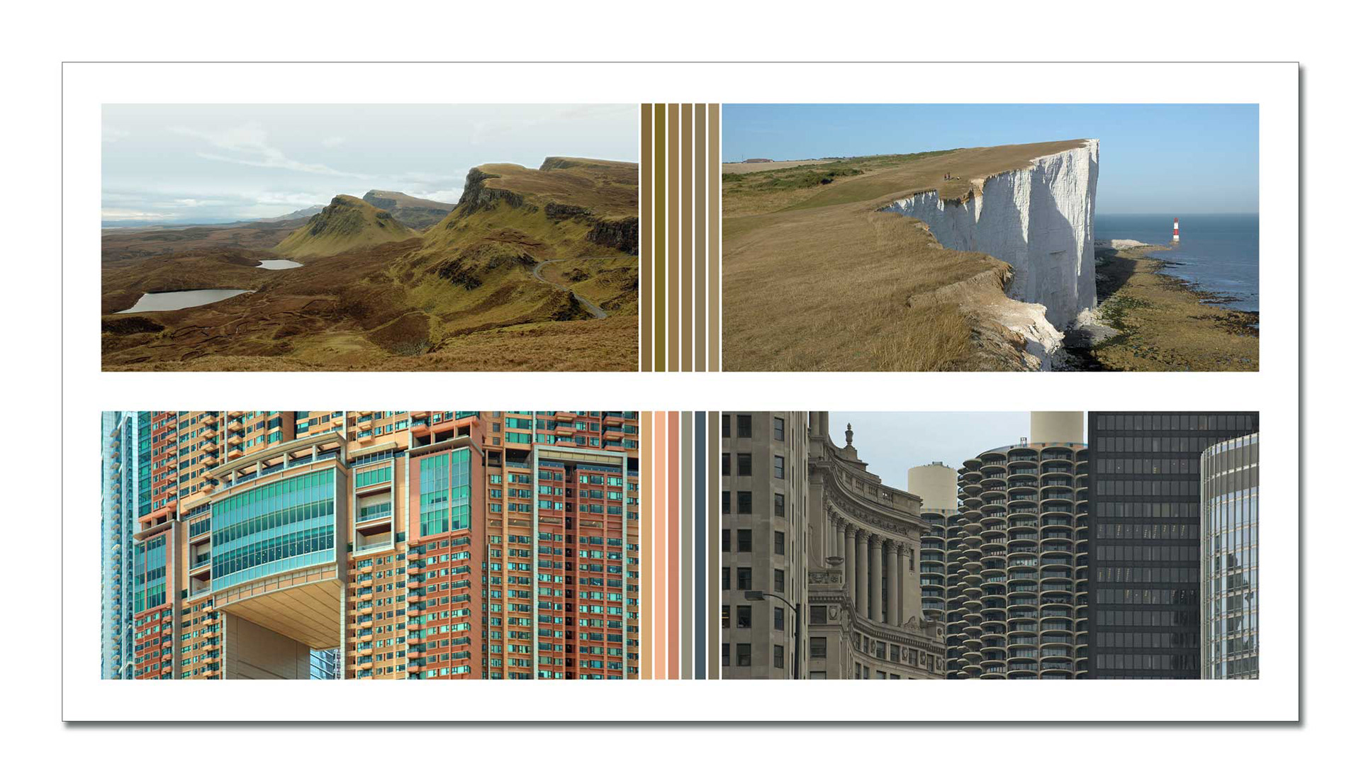
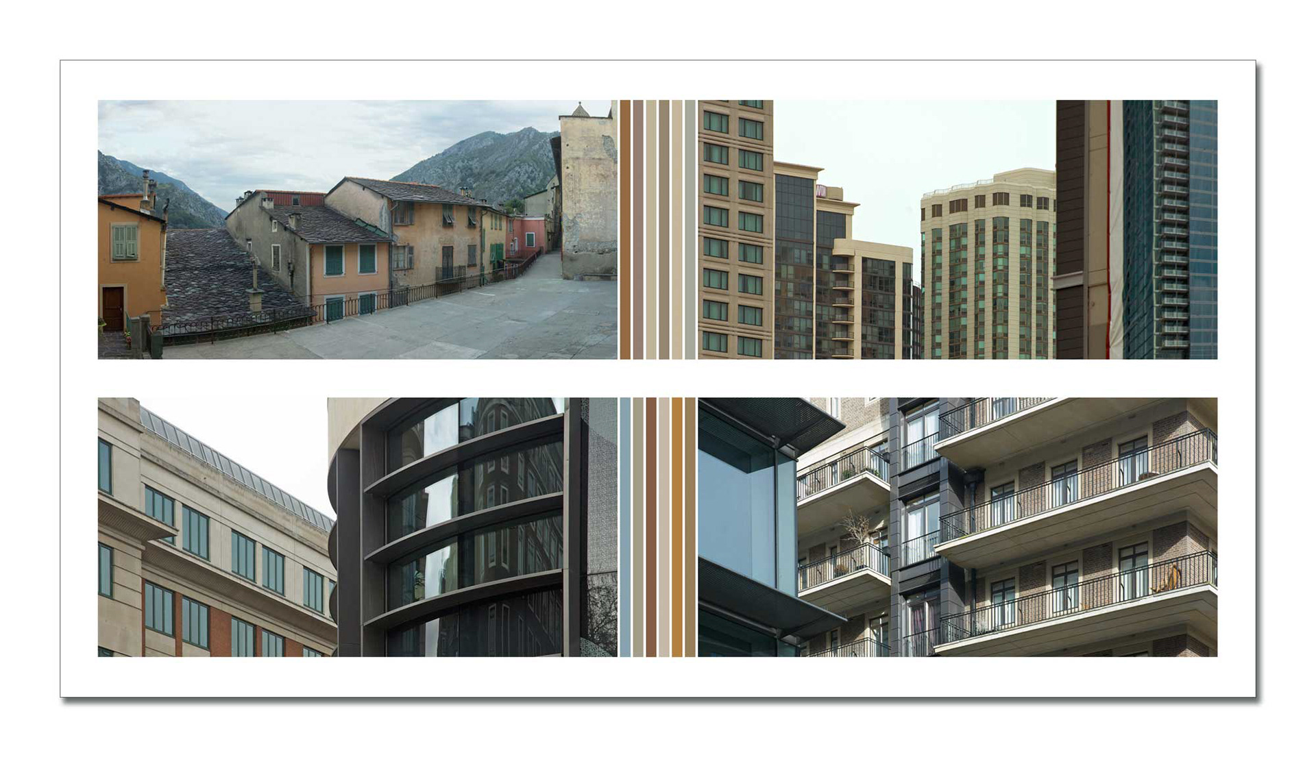
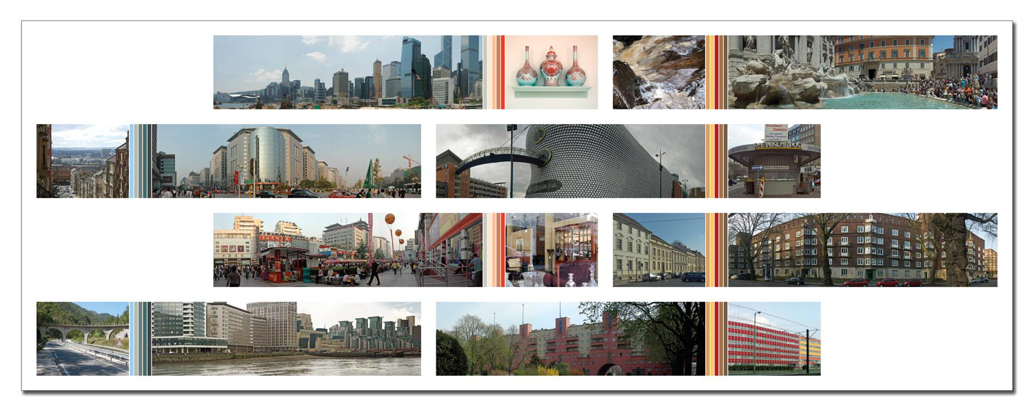
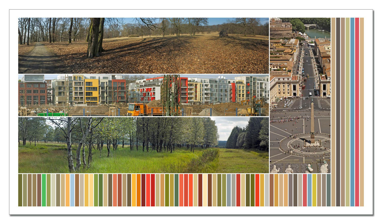
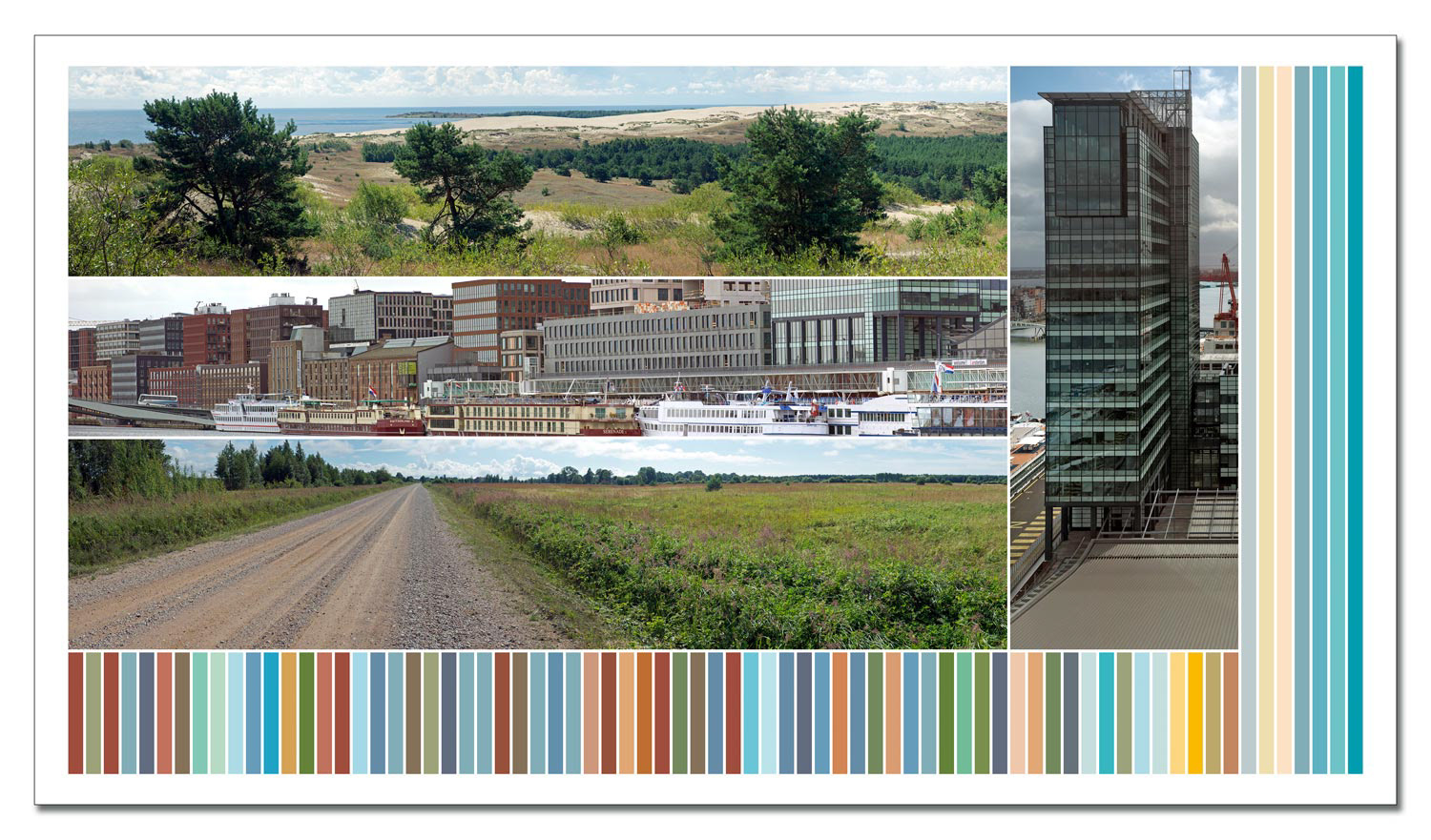
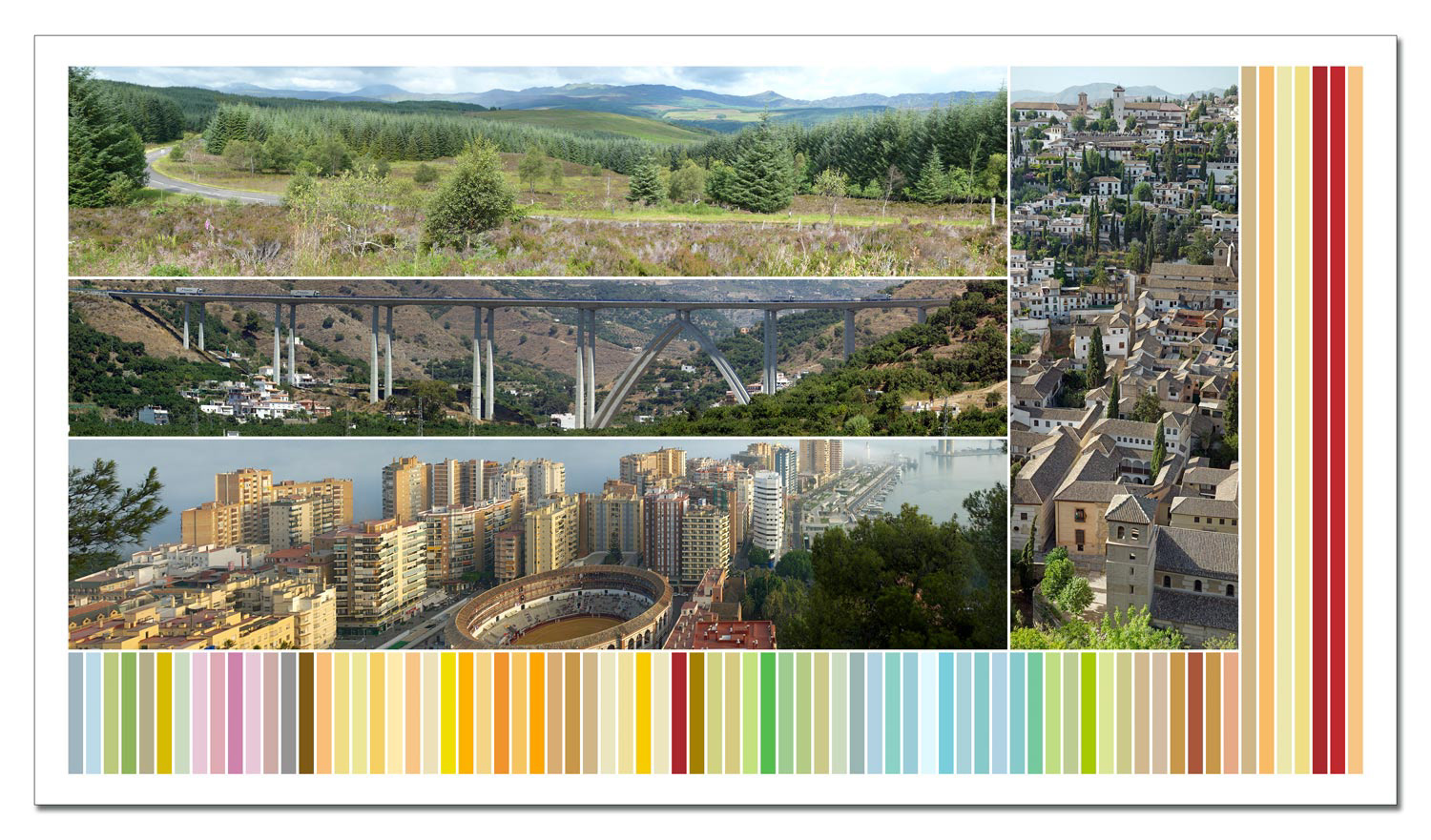
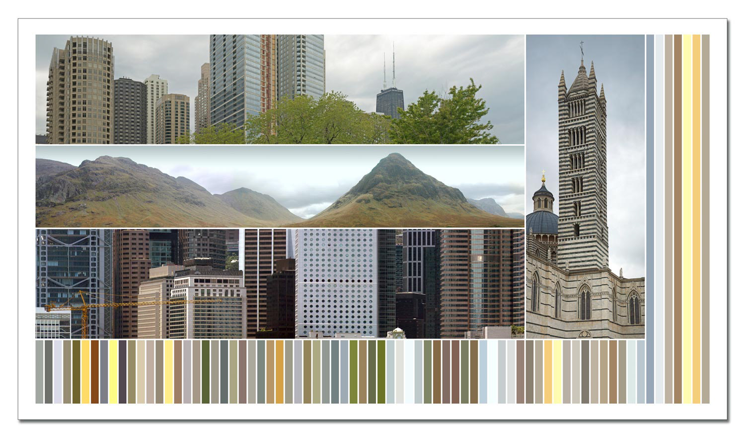
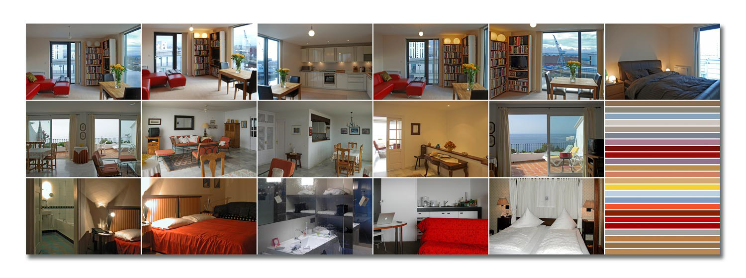
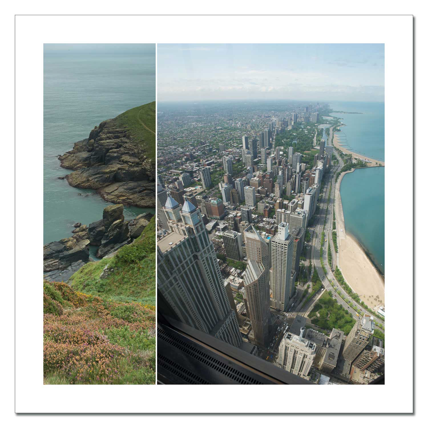
Album Two - Perspectives - 2010
Perspectives was conceived in 2010 and comprises 34 works presented in 17 pairs. Two longitudinal photographs are placed opposite each other – separated by six vertical strips of colour, the tones of which are taken from the image content. The photographs rarely come from the same place; the decisive factor is not geographical references, but formal connections that open up new associations in terms of content.
The pairs of images each measure 203 × 50cm and are produced as photographic prints behind acrylic glass. Framing is deliberately omitted in order to enable the most direct possible connection between image and space.
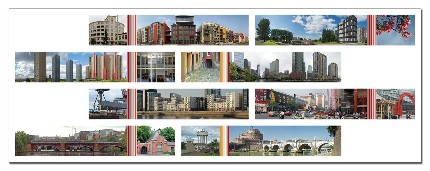
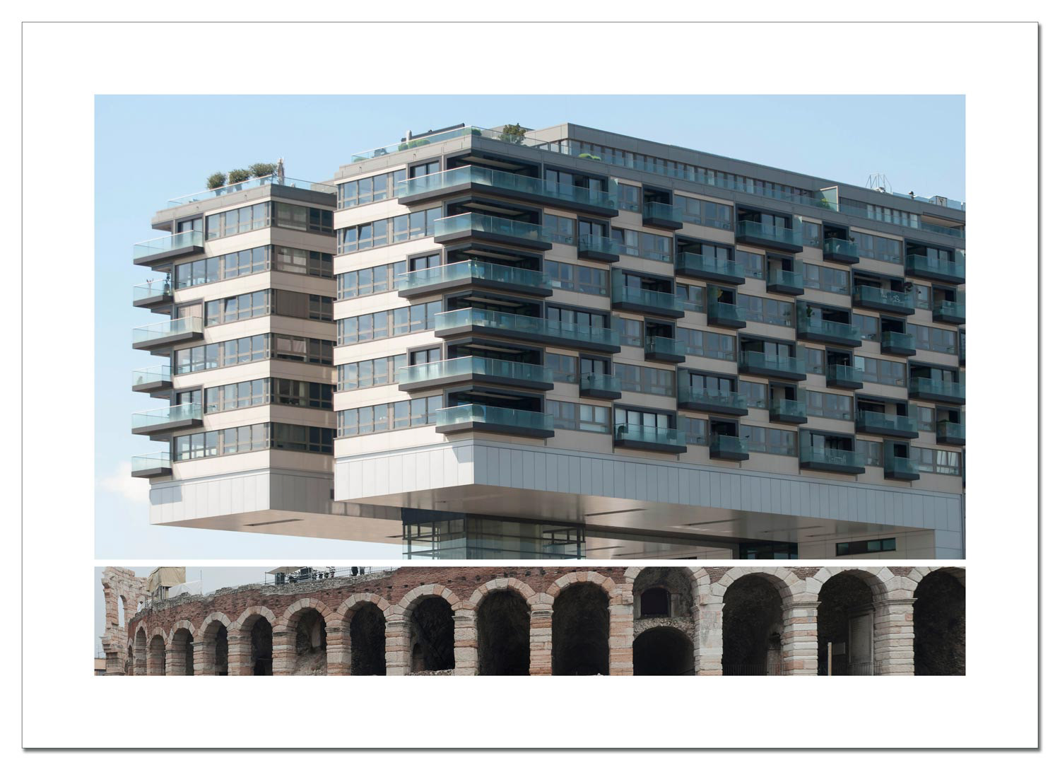
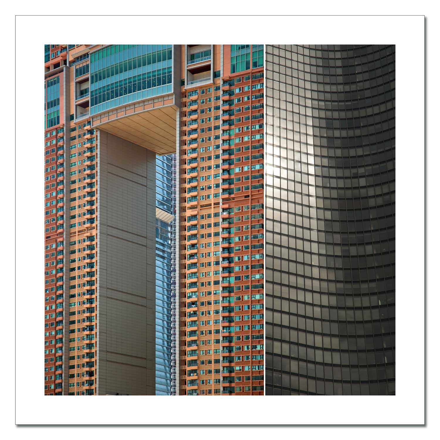
Album Three - flush - 2011
Flush was created in 2011 and is based on the principle of perspectives. Each sheet combines a rectangular format with a panoramic format – alternately positioned on the left or right. In the complete version, all 96 elements come together to form an expansive wall piece. Coloured dividing strips, taken from the adjacent photographs, weave the parts of the picture into a rhythmic overall structure. Their colour gradients extend over several rows and create a shadow of visual continuity.
The individual elements – photographic prints behind acrylic glass, unframed – measure 52×10cm. Eight elements form one sheet each. Depending on the connection pattern, formats of 134×50cm or 140×50cm result.
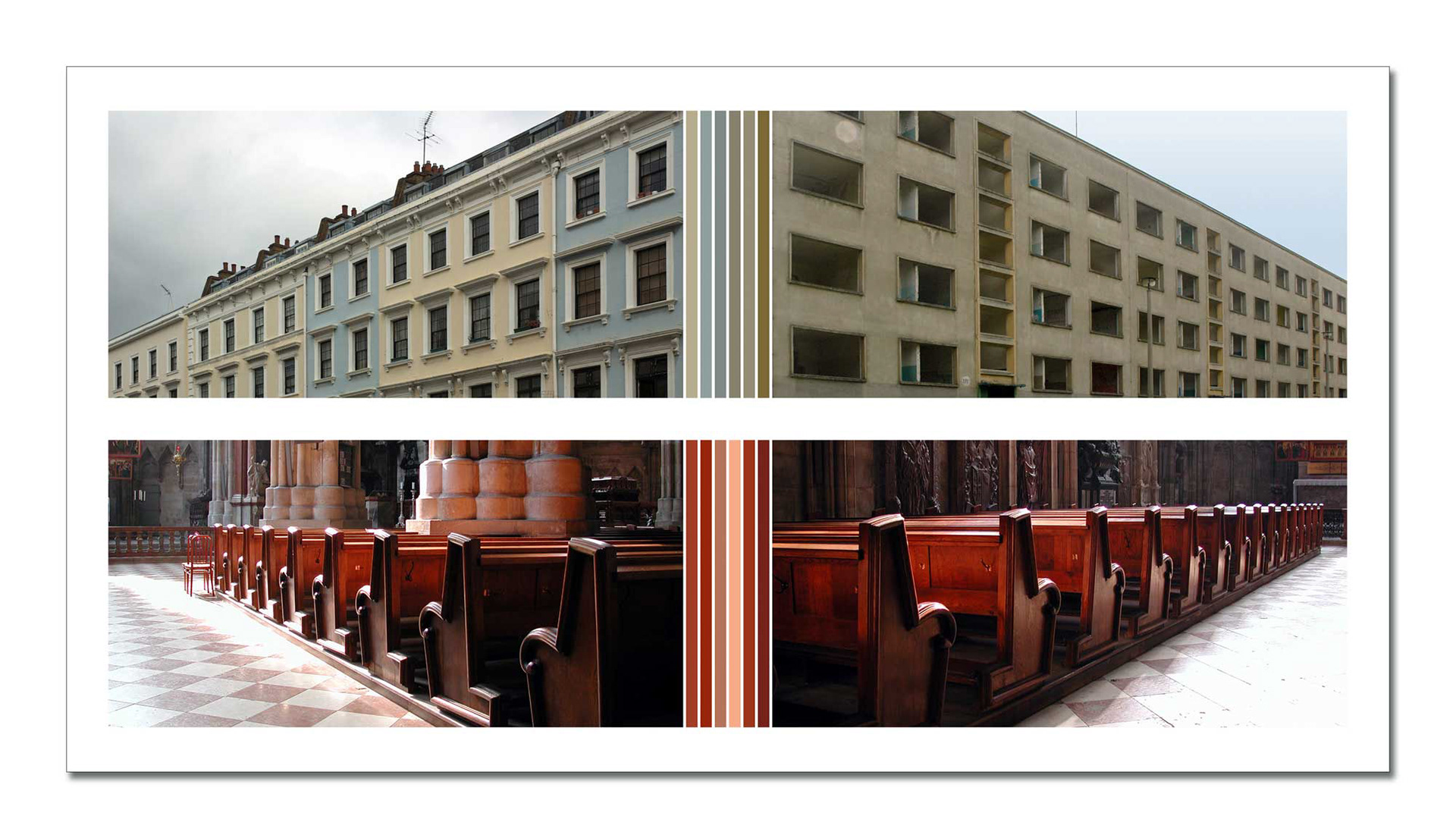
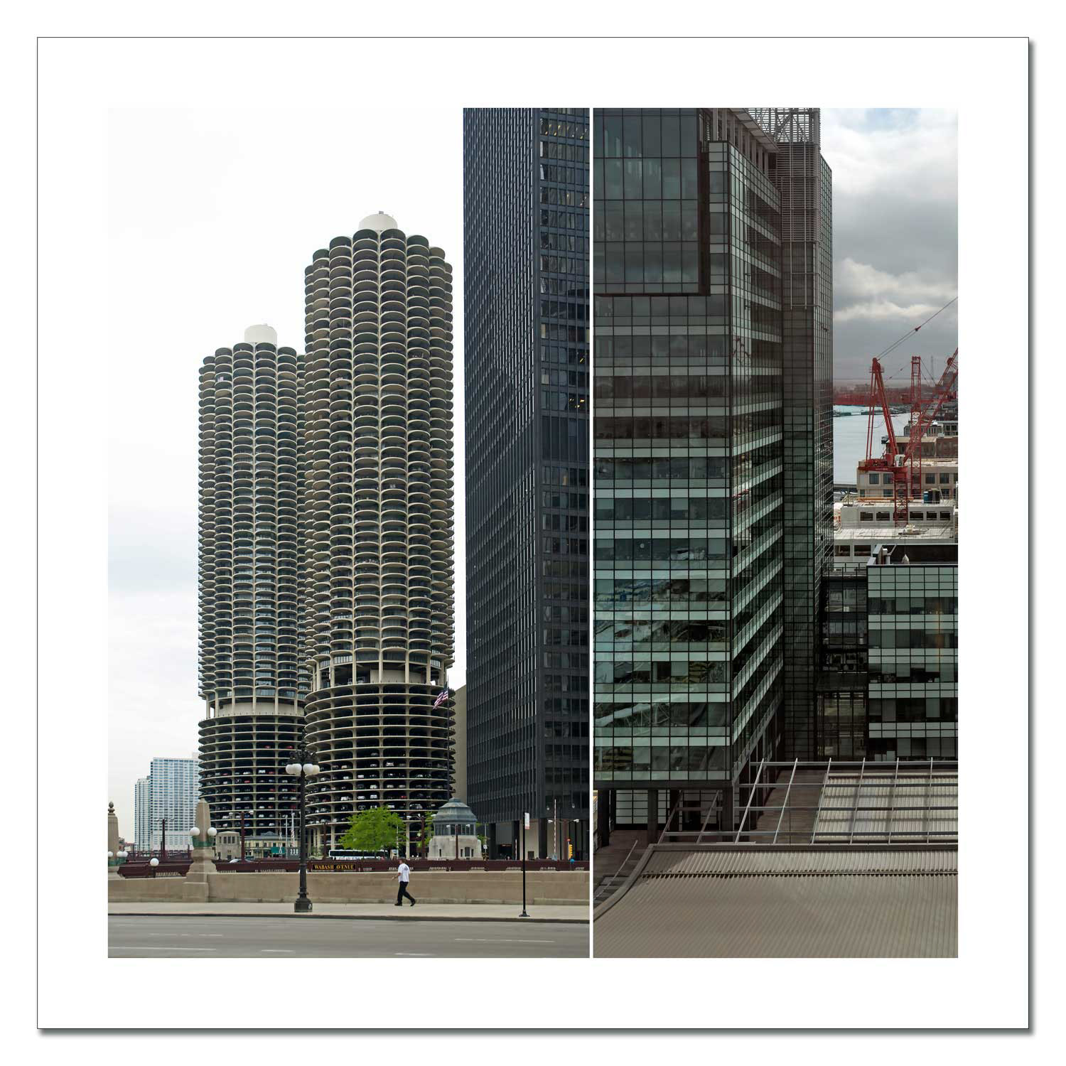
Album Four - Footnotes - 2011
Footnotes deliberately dispenses with coloured separating elements. Instead, a rectangular main image is undercut by a narrow panoramic strip – like a visual footnote that keeps the eye still and casually in motion. The 31 sheets in the series were developed in 2011, based on an earlier photographic experiment from 2006.
All works measure 100×70cm and are produced as framed photographic prints.
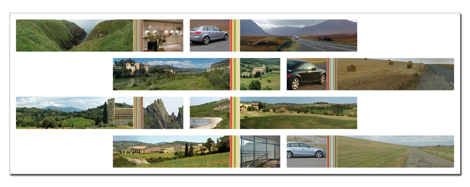
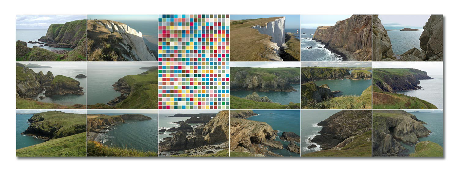
Album Five - Marginal Matters - 2012
Marginal Matters was created in 2012, based on photographic experiments from 2005. The series comprises 23 large-format sheets: three horizontal panoramic photographs are framed vertically by a portrait-format image and concluded by an oblique colour stripe.
This compositional structure draws attention to peripheral zones and transitions – where images intersect, interlock or interrupt each other.
The works measure 230×130cm and are presented as framed photographic prints.
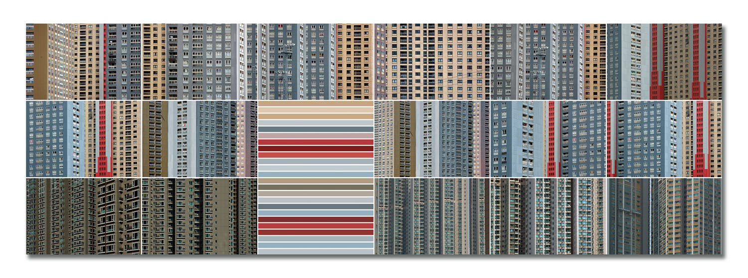
Album Six - Reminder Tables - 2013
Reminder Tables was created in 2013 and is the largest image carrier in the series. Each sheet is made up of 18 landscape-format fields, two of which are combined into coloured blocks of strips or squares. The colour values of these blocks are generated using a random algorithm that is based on the tonal mood of the neighbouring photographs.
The underlying grid of 16 fields serves as a structured memory for visual notations – photographic fragments of memories of places, journeys and visual axes. The multitude of motifs creates a dense structure of references without asserting fixed narratives.
The series comprises 35 sheets in 160×60cm format, produced as framed photographic prints.
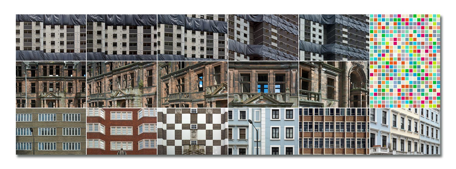
Album Seven - Tall Order - 2013
Tall Order was compiled in 2013 and takes up an experimental layout from 2010. Each sheet shows two photographs, juxtaposed in a square format. The juxtaposition does not follow any content-related guidelines, but tests the potential of formal friction – how much contrast, how much harmony can be demanded without the images losing their independence?
The series comprises 35 sheets in 80×80cm format, produced as framed photo prints.
Album Eight - Bottomline - 2014
Bottomline was developed in 2014 and is based on a grid principle from 2005. It forms the conclusion of the Eight Albums series – not only in terms of content, but also compositionally. Vertically arranged photographs from the archive are at the centre of each sheet, flanked or completed by two horizontal images. Coloured stripes act as connecting columns or framing end lines and lend structure and rhythm to the pictorial structure.
The series comprises 29 sheets in 60×120cm format, produced as framed photo prints.